# Set the seed so you can reproduce my results
set.seed(42)
simdata <- rbinom(100, 100, 0.5)4 Introduction to Statistical Modeling
The challenge we are faced with when analyzing RNA-seq data, or any data for that matter, is to draw conclusions in a way that accounts for the randomness inherit in our data. In the last chapter, we introduced a number of tools, i.e., probability distributions, for describing common types of randomness. Once we have a sense of how to describe the variance in our data, i.e., the combination of probability distributions that represent good “models” of our data, how do we put these models to use? The answer to this question is known as “fitting the model to your data”, and is the topic of this chapter.
4.1 Developing an intuition for model fitting
This exercise will walk you through how to think about what it means to “fit” a model. The key tool in our arsenal is going to be simulation, where we create data that follows known distributions. Your task, if you are willing to accept it, is to figure out how to recover the parameters you used in your simulation from the noisy data generated by the simulator. Are you ready? I’ll start with a guided exercise, and then present some open-ended exercises to get you exploring model fitting.
4.1.1 Guided exercise
Step 0: Devising a model
Let’s say you would like to estimate what fraction of the nucleotides in the actual RNA population are purines (Gs and As). Each nucleotide in an RNA can either be a purine or a pyrimidine. How would you go about answering this question?
Step 1: Simulate some data
For this exercise, I am going to simulate binomially distributed data, and devise a strategy to figure out what prob I used in this simulation. Obviously, I will know what prob I used, but in the real world, you won’t have access to the true parameters of the universe. Knowing the truth helps us know if we are on the right track though, and is why simulations are such a useful tool:
Technically, there are two parameters that I had to set here, size and prob. In this case, I am going to assume that size is data I have access to. Usually, if we are modeling something as binomially distributed, we will know how many trials there were.
Step 2: Visualize your data
Let’s see what the data looks like:
library(ggplot2)
library(dplyr)
Warning: package 'dplyr' was built under R version 4.3.2
Attaching package: 'dplyr'The following objects are masked from 'package:stats':
filter, lagThe following objects are masked from 'package:base':
intersect, setdiff, setequal, unionsim_df <- tibble(successes = simdata)
sim_plot <- sim_df %>%
ggplot(aes(x = successes)) +
geom_histogram() +
theme_classic()
sim_plot`stat_bin()` using `bins = 30`. Pick better value with `binwidth`.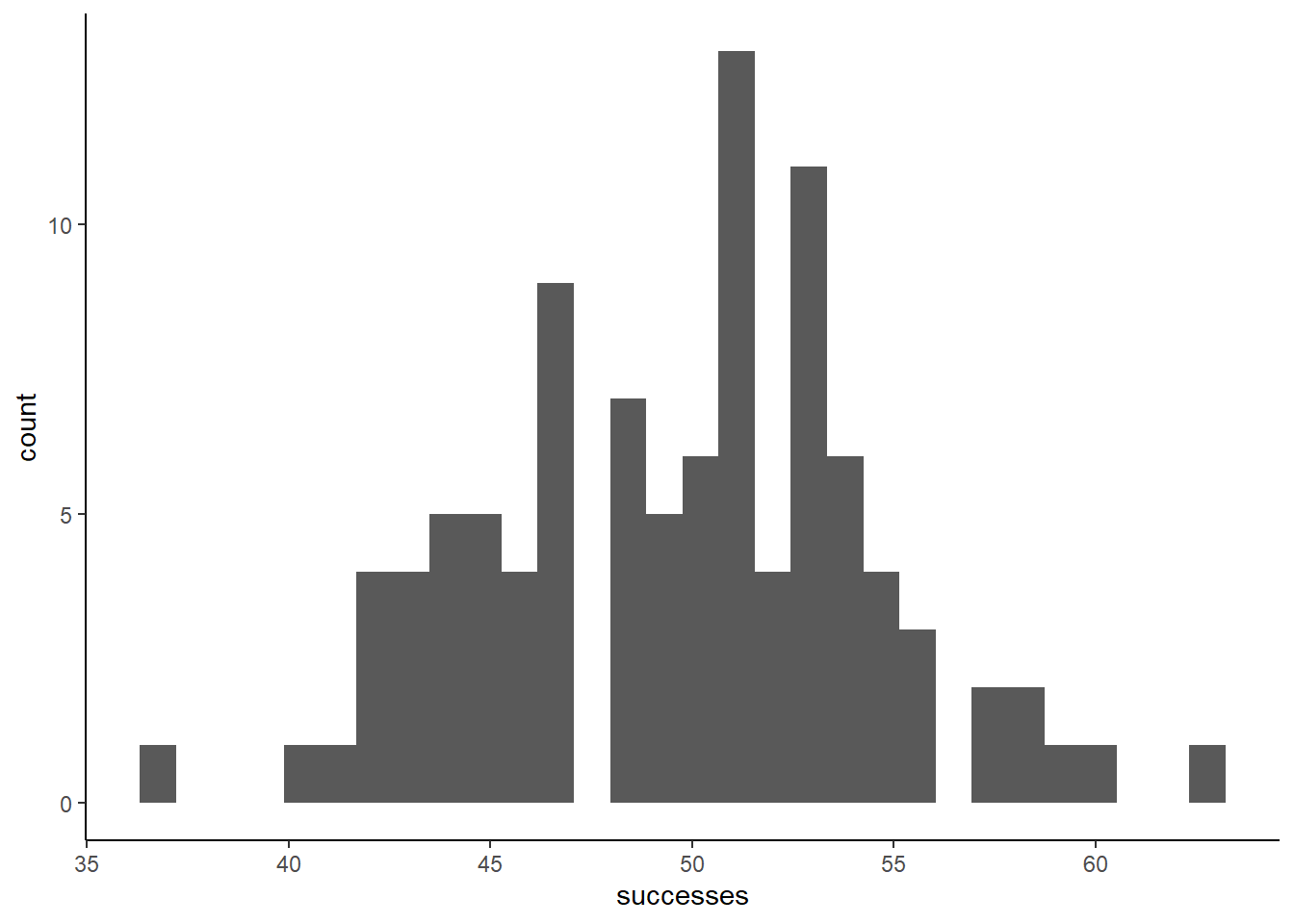
Does the data look at all surprising? We set prob equal to 0.5, so on average, we expect 50% of the trials to end in successes. If we perfectly hit this mark in our finite sample, that would mean 50 successes. Let’s annotate this mark on the plot
sim_plot +
  geom_vline(xintercept = 50,
             color = 'darkred')
`stat_bin()` using `bins = 30`. Pick better value with `binwidth`.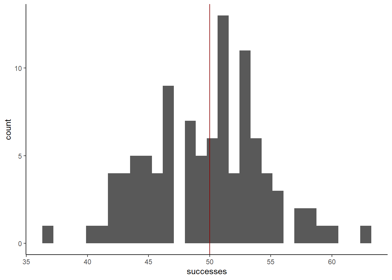
It’s a bit noisy, but the data does seem to be roughly centered around 50. That’s a good sign that our simulation worked, but now we need to think about how we would have figured out that the prob in this case was 0.5
Step 3: Fight simulations with simulations
Our goal is to find a binomial distribution prob parameter that accurately describes this data. An intuitive way to think about doing this is to simulate data with candidate values for prob, and see how similar the simulated data is to the real data. Here’s how you might do that:
### With a for loop
library(tidyr)
candidates <- c(0.1, 0.25, 0.5, 0.75, 0.9)

sim_list <- vector(mode = "list",
                  length = length(candidates))
for(c in seq_along(candidates)){

  sim_list[[c]] <- rbinom(100, 100, candidates[c])

}
names(sim_list) <- as.factor(candidates)
sim_df <- as_tibble(sim_list) %>%
  pivot_longer(names_to = "prob",
               values_to = "successes",
               cols = everything())

sim_df %>%
  ggplot(aes(x = successes,
             fill = prob,
             color = prob)) +
  geom_histogram(alpha = 0.1,
                 position = 'identity') +
  geom_histogram(data = tibble(successes = simdata,
                               prob = factor('data')),
                 aes(x = successes),
                 color = 'black',
                 alpha = 0.1,
                 fill = 'darkgray') +
  scale_fill_viridis_d() +
  scale_color_viridis_d() +
  theme_classic() +
  ggtitle('data in black/gray') +
  xlim(c(0, 100))
`stat_bin()` using `bins = 30`. Pick better value with `binwidth`.
`stat_bin()` using `bins = 30`. Pick better value with `binwidth`.Warning: Removed 10 rows containing missing values (`geom_bar()`).Warning: Removed 2 rows containing missing values (`geom_bar()`).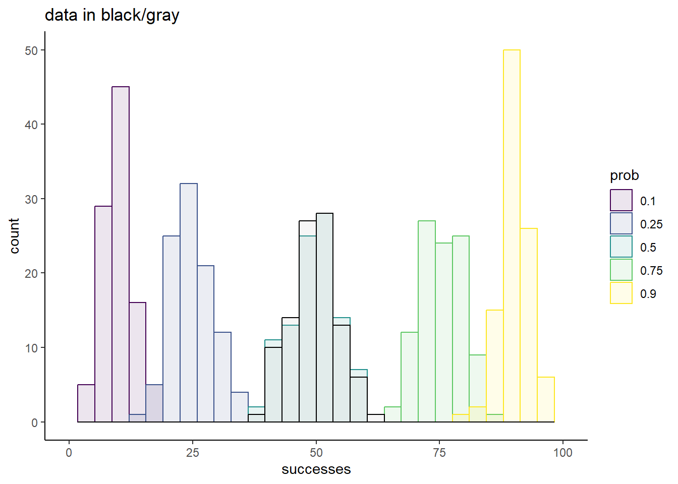
sim_df %>%
  ggplot(aes(x = successes,
             fill = prob,
             color = prob)) +
  geom_density(alpha = 0.1,
                 position = 'identity') +
  geom_density(data = tibble(successes = simdata,
                               prob = factor('data')),
                 aes(x = successes),
                 color = 'black',
                 alpha = 0.1,
                 fill = 'darkgray') +
  scale_fill_viridis_d() +
  scale_color_viridis_d() +
  theme_classic() +
  ggtitle('data in black/gray') +
  xlim(c(0, 100))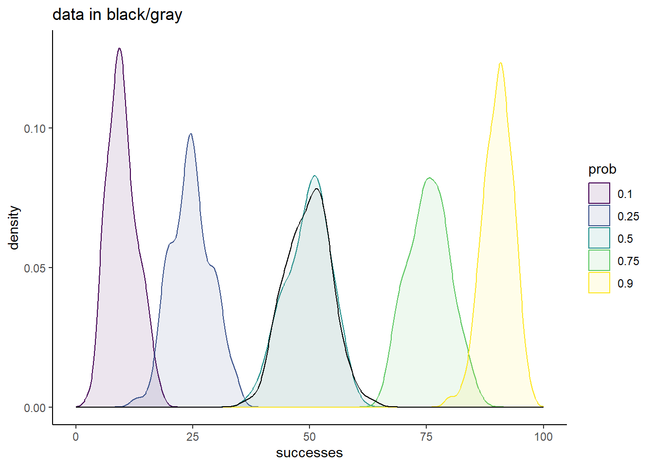
Of these small subset of candidate prob values, 0.5 is the clear winner. The overlap of the simulation with the data is striking, and strongly suggests that this is a good fit to our data.
Of course, we know the true value is 0.5, and this knowledge guided our choice of candidates. So let’s explore a different range of candidates, all of which are much closer to the known truth:
### With a for loop
library(tidyr)
candidates <- c(0.48, 0.49, 0.5, 0.51, 0.52)

sim_list <- vector(mode = "list",
                  length = length(candidates))
for(c in seq_along(candidates)){

  sim_list[[c]] <- rbinom(100, 100, candidates[c])

}
names(sim_list) <- as.factor(candidates)
sim_df <- as_tibble(sim_list) %>%
  pivot_longer(names_to = "prob",
               values_to = "successes",
               cols = everything())


sim_df %>%
  ggplot(aes(x = successes,
             fill = prob,
             color = prob)) +
  geom_histogram(alpha = 0.1,
                 position = 'identity') +
  geom_histogram(data = tibble(successes = simdata,
                               prob = factor('data')),
                 aes(x = successes),
                 color = 'black',
                 alpha = 0.1,
                 fill = 'darkgray') +
  scale_fill_viridis_d() +
  scale_color_viridis_d() +
  theme_classic() +
  ggtitle('data in black/gray') +
  xlim(c(0, 100))
`stat_bin()` using `bins = 30`. Pick better value with `binwidth`.
`stat_bin()` using `bins = 30`. Pick better value with `binwidth`.Warning: Removed 10 rows containing missing values (`geom_bar()`).Warning: Removed 2 rows containing missing values (`geom_bar()`).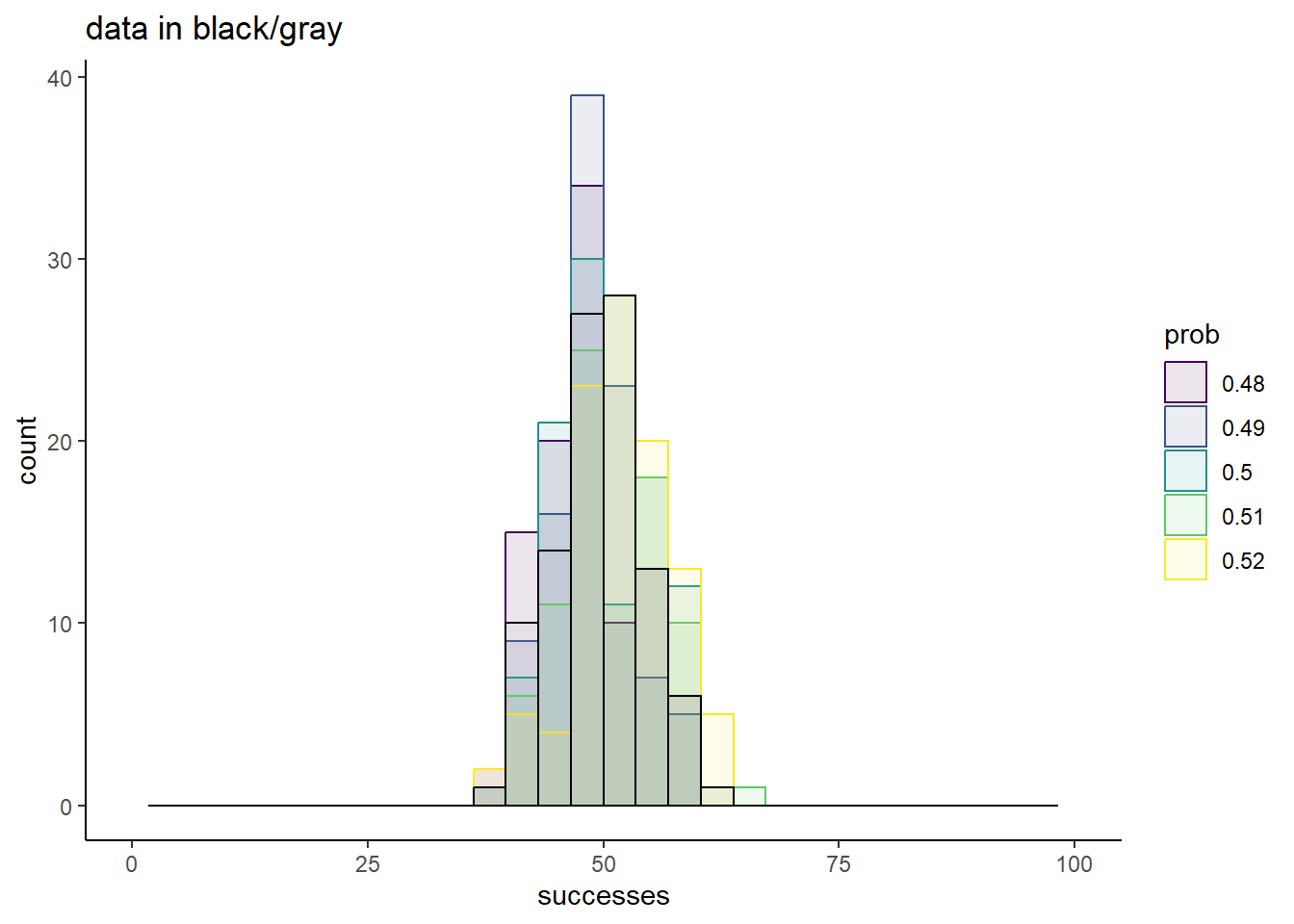
sim_df %>%
  ggplot(aes(x = successes,
             fill = prob,
             color = prob)) +
  geom_density(alpha = 0.1,
                 position = 'identity') +
  geom_density(data = tibble(successes = simdata,
                               prob = factor('data')),
                 aes(x = successes),
                 color = 'black',
                 alpha = 0.1,
                 fill = 'darkgray') +
  scale_fill_viridis_d() +
  scale_color_viridis_d() +
  theme_classic() +
  ggtitle('data in black/gray') +
  xlim(c(0, 100))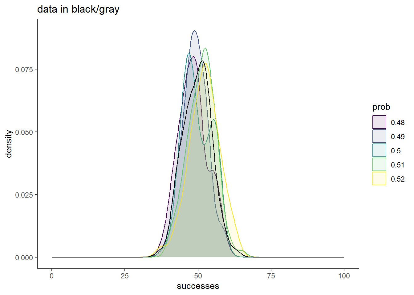
Now the comparisons are much messier. Sure, 0.5 is a great match, but none of these chosen values yield simulations too different from the truth.
From this, it is clear that there are ranges of values that we can confidently rule out as good conclusions for what prob best describes our data. Values of 0.25 or less, and values of 0.75 or more are very bad fits. There is also good evidence that a good fit is somewhere around 0.5, but the exact value that would represent the best guess is uncertain.
Step 4: Make fitting more rigorous
The current strategy we have employed could be referred to as “simulations and vibes”. We have simulated data with some values for the unknown parameter in question, and assessed by eye how close our simulated data matched our real data. Whlie this has offered some valuable insights, it’s important to recognize the fundamental limitations of such an approach:
- Each simulation with a given parameter value will yield different results. Random number generators are going to be random. One output of
prob = 0.5might look exactly like the real think, but so might one value ofprob = 0.48. - It’s time intensive. You have to simulate data for a bunch of different values, and then painstakingly stare at cluttered plots trying to make sense of which simulation fit your data the best.
- It’s subjective. None of our simulations matched the data exactly, and even if one run of a particular simulation did, see point 1 for why that can’t be considered conclusive evidence in favor of that parameter being the best. Lacking such a perfect match, we are forced to rely on ill-defined, self-imposed criteria for what the best fit is.
How can we fix this problem? What we need is a quantitative metric, a number that we can assign to every possible value of prob that describes how good of a fit it is to our data. It should have the following properties:
- It should be deterministic; a given value of
probshould yield a single unique value for this metric. - Higher values should represent better fits.
- The more data we have, the better this metric should do at predicting the true parameter value.
Sit and think about this for a while (maybe a couple decades, which is what it took the field to converge on this solution), and you’ll arrive at something called the “total likelihood”. In this part of the exercise, we’ll develop an intuition for this concept:
4.1.1.1 What is the likelihood?
When discussing a particular distribution, we have playing with its associated random number generator function in R. For the binomial distribution, this is the rbinom() function. If you check the documentation for rbinom() though, with ?rbinom, you’ll see that you actually get documentation for 4 different functions, all with a similar naming convention. We’ll find use for all of these at some point in this class, but for now, let’s focus on one that we briefly visited last week, dbinom().
Unlike rbinom(), dbinom() returns the same value for a given set of parameters every single time. It is not random:
dbinom(50, 100, 0.5)
dbinom(50, 100, 0.5)
[1] 0.07958924
[1] 0.07958924What does this value represent though. First, let’s understand its input:
x: The number of “successes”. So essentially what you could get out from a given run ofrbinom().size: Same as inrbinom(), the number of trials.prob: Same as inrbinom(), the probability that each trial is a success.
So it seems to quantify something about a particular possible outcome of rbinom(). It assigns some number to an outcome given the parameters you could have used to simulate such an outcome. What does this number represent though? To find out, let’s plot it for a range of x’s:
xs <- 0:100
ds <- dbinom(xs, 100, 0.5)

tibble(x = xs,
       d = ds) %>%
  ggplot(aes(x = x, y = d)) +
  geom_point() +
  theme_classic()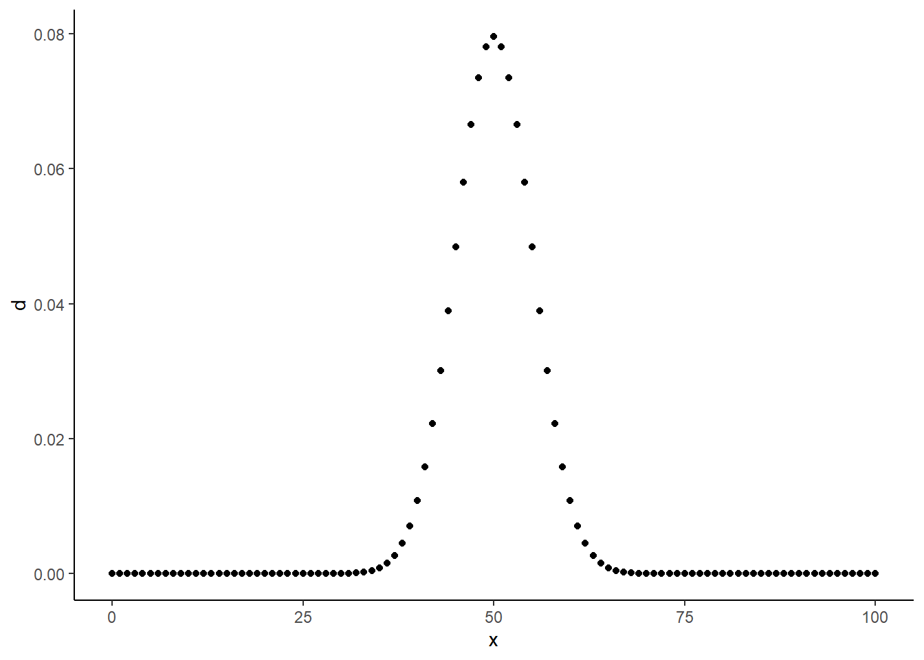
Values closer to 50 get higher numbers than values further from 50, and the plot seems to be symmetric around 50. What’s significant about 50? It’s \(size * prob\), or the average value we would expect to get from rbinom() with these parameters!
This investigation should give you some sense that the output of dbinom() is in some way related to the probability of seeing x given a certain size and prob. Is it exactly this probability? We can gut check by assessing some cases we know for certain. Like, what is the probability of seeing 1 success in 1 trial if prob = 0.5? 0.5, because that’s the defintiion of prob! What does dbinom() give us in this scenario:
dbinom(1, 1, 0.5)[1] 0.50.5; that’s a good sign that we are on to something. Try out some different values of prob:
dbinom(1, 1, 0.3)[1] 0.3dbinom(1, 1, 0.7)[1] 0.7dbinom(1, 1, 0.2315)[1] 0.2315Everything still checks out. How about the probability of 2 successes in 2 trials given a certain prob? Each trial has probability of prob of being a success, and each trial is independent. Therefore, the probability of 2 successes in 2 trials is \(prob * prob\). Does dbinom() give us the same output in that case?
# Expecting 0.25
dbinom(2, 2, 0.5)
[1] 0.25# Expecting 0.01
dbinom(2, 2, 0.1)[1] 0.01Sure thing!
Conclusion: dbinom(x, size, prob), tells us the probability of seeing x successes in size trials given the probability of a success is prob. This is known as the “likelihood of our data”.
4.1.1.2 Calculating the total likelihood
In the above examples, we took a single value of x, and passed it dbinom(). This told us the probability of seeing that one value given whatever parameter values we set. In most cases though, we typically have mulitple replicates of data. How can we calculate the likelihood of our entire dataset?
I’ll pose a solution, and then demonstrate why the solution makes sense. The solution is to run dbinom() on each data point, and multiply the outcomes. This can be done like so:
data <- c(48, 50, 49, 50)
likelihood <- prod(dbinom(data, size = 100, prob = 0.5))
Why does this make sense? Consider a simple example where we flip a single coin twice. Say we see heads (H) then tails (T). What was the probability of seeing this if the coin had been fair? Well, consider the following geometric intuition for probability. Flipping a coin is like throwing a dart at a number line that ranges from 0 to 1. If that dart is equally likely to land anywhere on the number line, then we could define heads as that dart landing at a value of less than the probability of heads. This is because, a fraction x of the line lies to the left of x. Flipping a coin twice and getting heads then tails means having the dart land to the left of 0.5 once, and to the right of 0.5 once. We can visualize this as a square formed by our two lines. We are thus asking what the probability is that if we were to throw a dart at this square, that we land in the upper right quadrant (left of 0.5 on first throw, right of 0.5 on second). Well, what fraction of the total area does each quadrant take up? It’s whatever the probability of heads is (x) times the probability of tails (1-x). Thus, probabilities of seeing multiple data points multiplies.
There is one hidden assumption here, which is that of independence. We are assuming that the result of the first coin toss has no impact on the result of the second coin toss. This is an assumption ubiquitous throughout statistics, as it not only makes analyzing our data easier, in many cases meaningfully analyzing our data without this assumption would be impossible. At the same time though, its very important to be aware of this assumption, as there are lots of situations in which it can be seriously violated.
Conclusion: If each of a collection of N datapoints is “independent”, then the total likelihood of the dataset is equal to the product of the individual datapoint likelihoods. Datapoints being independent means that the value of any given datapoint does not influence the values of any other datapoint.
COMPUTATIONAL ASIDE
Above, we calculate the total likelihood. One problem that we will often run into with this calculation is that the product of all of the individual data point likelihoods will be really small for some potential parameter values. In this case, our computer might just assign these a value of 0, even though the true likelihood is non-zero. This is called an “overflow error”, and can mess with some of the things we do later in this course.
For this reason, we will instead calculate the “log-total-likelihood”. This is just the logarithm of the total likelihood. Why does this matter? All of the d<distribution>() functions have one additional parameter named log, that can be set to either TRUE or FALSE. Setting it to TRUE will lead to it outputting the logarithm of what it would otherwise output.
In addition, the log of a product is the same as the sum of logs:
numbers <- rbinom(100, size = 100, prob = 0.5)
ll_one_way <- log(prod(dbinom(numbers, 100, 0.5)))
ll_other_way <- sum(dbinom(numbers, 100, 0.5, log = TRUE))

ll_one_way == ll_other_way
[1] TRUESo it is almost always preferable to sum the log-likelihoods of individual datapoints than it is to multiply their regular likelihoods.
4.1.1.3 How can we use the total log-likelihood to fit models?
The total log-likelihood of our data turns out to be a great metric by which determine model fit. The idea is to find the parameter value that gives you the largest likelihood. That’s to say, we choose as our best fit the parameter value(s) that make our data as probabilistically reasonable as possible. This is known as the maximum likelihood estimates for our parameter(s). If we simulated data using this value, our simulated data would on average come closer to looking like our real data than it would for any other parameter values we could have simulated with.
How does this play out with our data? We can visualize the so-called log-likelihood function to see which value of prob maximizes it:
prob_guesses <- seq(from = 0, to = 1, by = 0.001)
log_likelihoods <- sapply(prob_guesses, function(x) sum(dbinom(simdata,
                                                           size = 100,
                                                           prob = x,
                                                           log = TRUE)))

Ldf <- tibble(ll = log_likelihoods,
              prob = prob_guesses)

Ldf %>%
  ggplot(aes(x = prob, y = ll)) +
  geom_line() +
  theme_classic()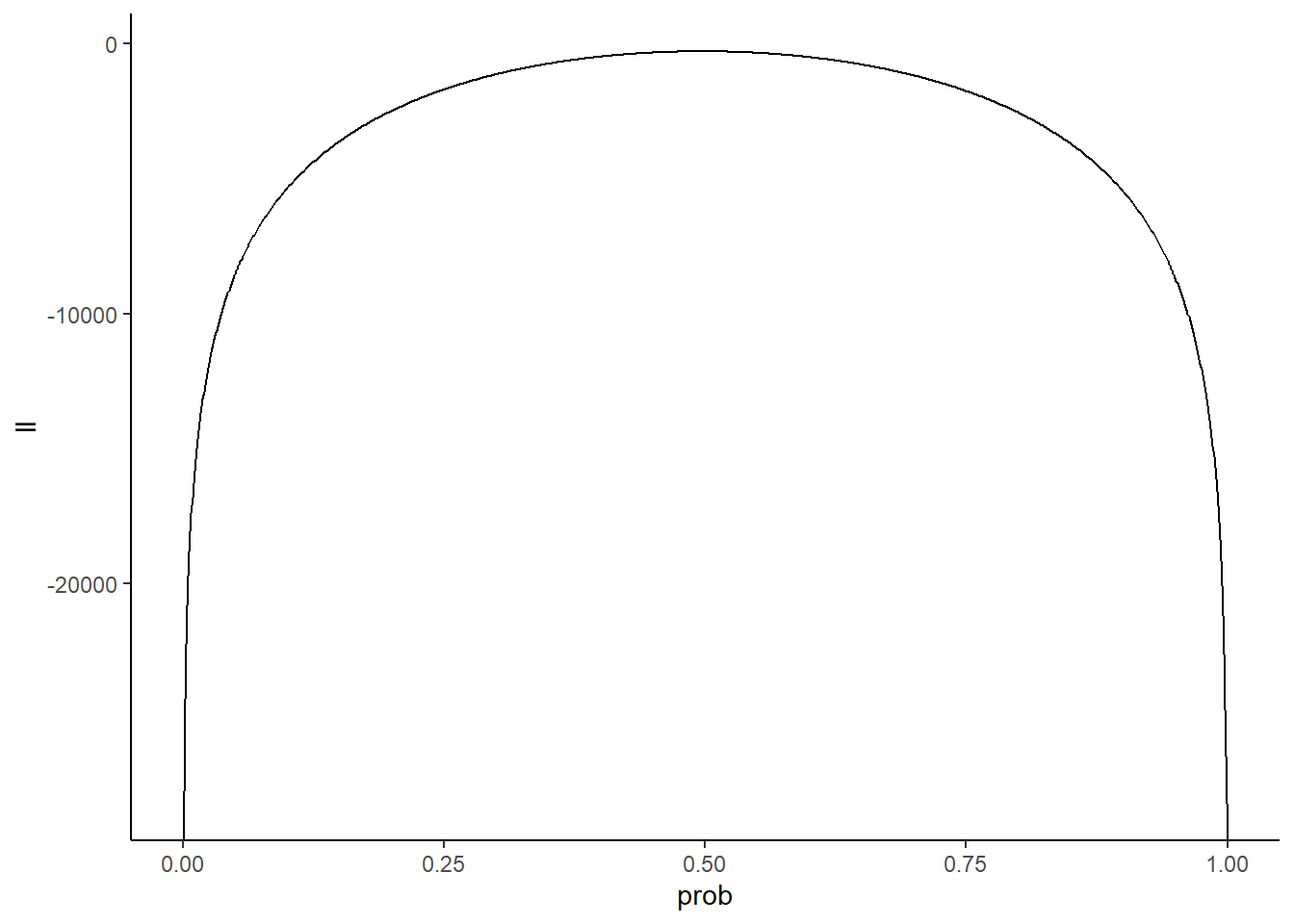
Keep in mind the y-axis is a log scale, so differences of 1 equate to an order of magnitude difference on the “regular” scale. Let’s zoom in around our putative values to get a better look at which value of prob is most likely:
zoomed_plot <- Ldf %>%
  filter(prob >= 0.45 & prob <= 0.55) %>%
  ggplot(aes(x = prob, y = exp(ll))) +
  geom_line() +
  theme_classic()
zoomed_plot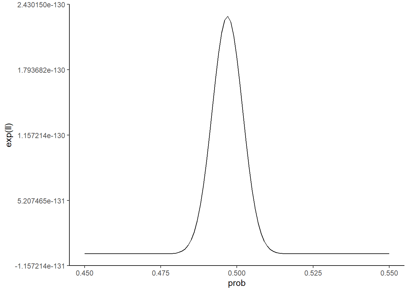
It looks like a value of prob = 0.5 is not strictly speaking the best guess. Let’s see what value in our grid of prob_guesses gives the highest value, and annotate this value on our zoomed in plot:
max_ll <- Ldf %>% filter(ll == max(ll)) %>%
  dplyr::select(prob) %>% unlist() %>% unname()
max_ll
[1] 0.497zoomed_plot +
geom_vline(xintercept = max_ll,
color = 'darkred')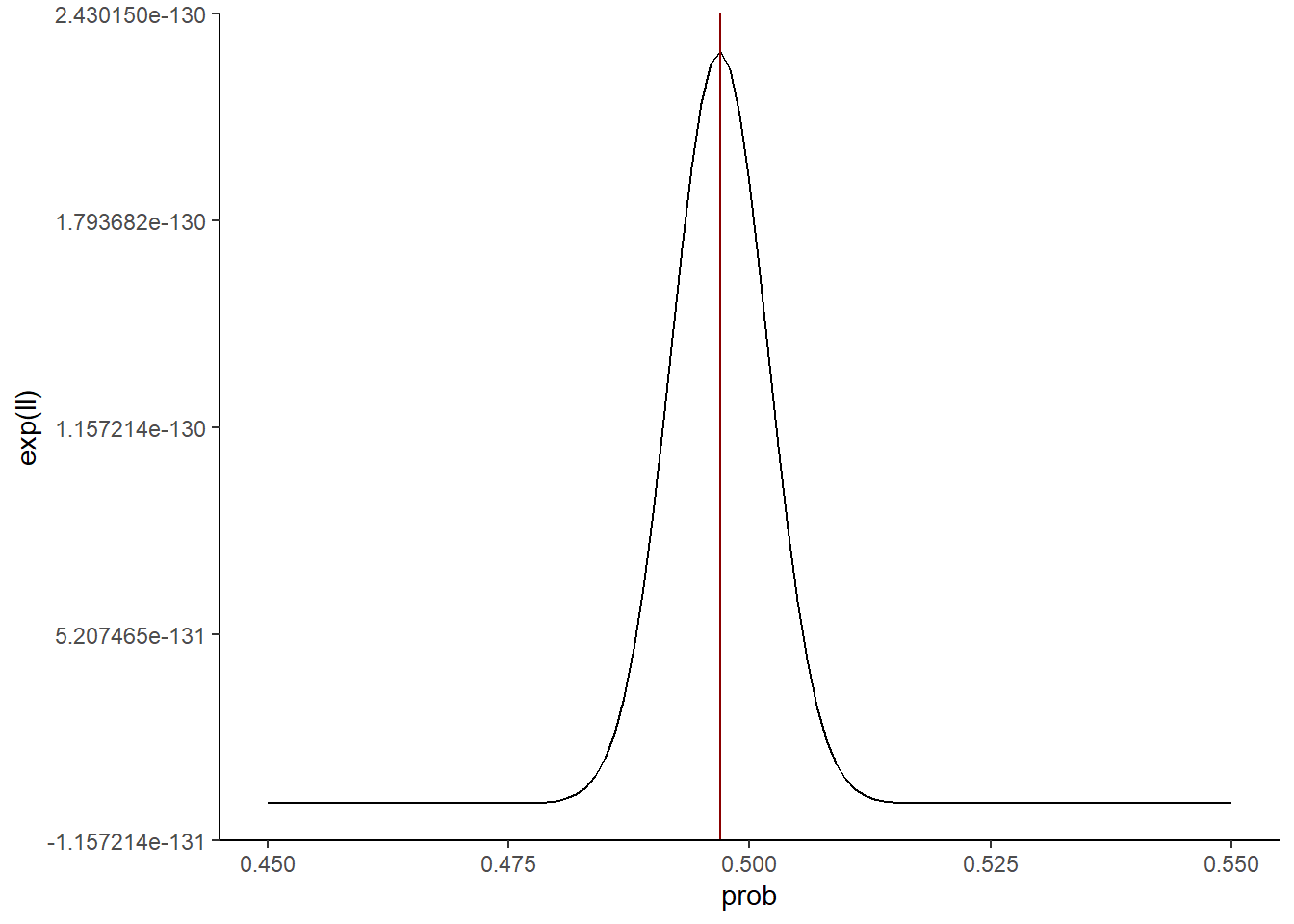
So our best guess given this metric is a value for prob of around 0.497. That’s pretty darn close to the true value of 0.5!
4.1.1.4 How we ACTUALLY find the maximum likelihood
While the strategy for finding the maximum likelihood parameter estimate used above is ok for this toy example, we can do a lot better in terms of the speed and generalizability of our computational solution. If we can provide the function that we want to maximize (e.g., the log-likelihood), and the data needed to calculate the value of our function for a given parameter estimate, then R provides us with the tool necessary to find the parameter estimate that maximizes our function. That tool is the optim() function.
Here is how you can use optim() to find the maximum likelihood estimate of prob in our example:
### Step 1: Define the function to maximize
binom_ll <- function(params, data, size = 100){

  # We estimate on a log scale for convenience so we convert here
  prob <- params[1]

  # Log-likelihood assuming binomial distribution
  ll <- dbinom(data,
               size = size,
               prob = prob,
               log = TRUE)

  # Return negative because optim() by default will find the minimum
  return(-sum(ll))

}


### Step 2: run optim()
fit <- optim(
  par = 0.5, # initial guess for prob
  fn = binom_ll, # function to maximize
  data = simdata, # something passed to the function
  method = "L-BFGS-B", # Most efficient method for finding max,
  lower = 0.001, # Lower bound for parameter estimate
  upper = 0.999 # Upper bound for parameter estimate
  )


### Step 3: Inspect the estimate
prob_est <- fit$par[1]
prob_est
[1] 0.4969This is very close to what we found through other means, but it has the distinction of being the most accurate, automated method we have devised. In fact, this method, known as numerical estimation of the maximum likelihood parameter(s), is a mainstay in modern statistics.
END OF LECTURE 1
4.1.2 Quantifying uncertainty
The key problem that we set up in both this chapter and the last is one of navigating the randomness in our data. We have to analyze our data in a way that is cognizant of this randomness. This means not only estimating things we care about, but also being honest about how confident we are in our estimates.
In the binomial distribution fitting exercise, we arrived at a strategy for finding what we considered the “best” estimate for the prob parameter. On that journey though, you may have gotten the sense that there wasn’t one definitive parameter estimate. Rather, a range of estimates would have been reasonable given the data. You may have also realized that we didn’t fully stick the landing. Our estimate was not exactly equal to the true value of 0.5. It would thus be best if we didn’t only report a single number as our best estimate. We need to also provide some sense of how confident we are that our estimate is right. In this section, we will discuss some of the most common ways to do this.
4.1.2.1 The bootstrap
The boostrap is one of the cutest, somehow legitimate ideas in statistics that is a shockingly accurate way by which to assess uncertainty in your parameter estimates. The idea is to take your original dataset and sample from it with replacement. This means creating a new dataset, the same size of the original dataset, which is generated by randomly choosing datpoints from the original dataset until you have chosen N datapoints (N being the number of datapoints in your original dataset). Sampling “with replacement” means that every time you sample a datapoint, you “put it back”, so to speak. So each sample is taken from the full original dataset. This ensures that the new dataset you generate has almost no chance of looking exactly like your original dataset. You can then re-estimate the maximum likelihood parameter with each new re-sampled dataset, and see how much variability there is from re-sampling to re-sampling. From this, you can derive measures of uncertainty, like the standard devitaion of your resampled data estimates.
Let’s put this into action with our simulated data:
nresamps <- 500
estimates <- rep(0, times = nresamps)

for(i in 1:nresamps){

  ### Step 1: resample
  resampled_data <- sample(simdata,
                           size = length(simdata),
                           replace = TRUE)


  ### Step 2: estimate
  fit <- optim(
    par = 0.5, # initial guess for prob
    fn = binom_ll, # function to maximize
    data = resampled_data, # something passed to the function
    method = "L-BFGS-B", # Most efficient method for finding max,
    lower = 0.001, # Lower bound for parameter estimate
    upper = 0.999 # Upper bound for parameter estimate
    )


  ### Step 3: save estimate
  estimates[i] <- fit$par[1]


}

### Uncertainty
sd(estimates)
[1] 0.004929947### Check out distribution of estimates
tibble(estimate = estimates) %>%
ggplot(aes(x = estimate)) +
geom_histogram(color = 'black',
fill = 'darkgray',
bins = 25) +
theme_classic() +
xlab("Estimate") +
ylab("Count") +
xlim(c(0.45, 0.55))Warning: Removed 2 rows containing missing values (`geom_bar()`).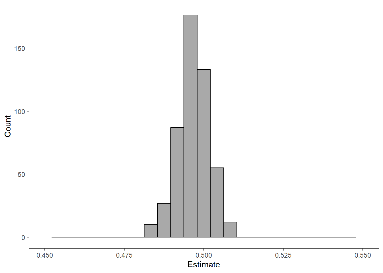
4.1.2.1.1 Exercise:
Rerun this bootstrapping multiple times (e.g., 5) for 3 different values of nresamp. How does the size of nresamp relate to the output.
4.1.2.2 The shape of your likelihood
Bootstrapping is easy, intuitive, and great. It is not without its downsides though. For one, it is often computationally intensive. We are forcing ourselves to rerun our analysis N times, where N is our chosen number of bootstrap samples. If our dataset is large and/or our model complex (i.e., there are lots of parameters to estimate), this can take our computer quite a long time. In addition, as this method relies on simulation, it is prone to variation. That is to say, from bootstrap to bootstrap, your estimate for your uncertainty will vary. You can decrease the amount of variance by increasing N, but that comes with greater comptuational cost. It would be awesome if we could somehow extract information about our uncertainty directly from our data and model.
Such a method exists! The premise is that we can derive a measure of uncertainty from the shape of our likelihood function. Let’s see what that means by exploring two cases, one in which we have lots of data and one in which we have very little data.
# Simulate small and large datasets
small_data <- rbinom(10, size = 100, prob = 0.5)
big_data <- rbinom(100, size = 100, prob = 0.5)


# Calculate log-likelihoods
prob_guesses <- seq(from = 0, to = 1, by = 0.001)
small_log_likelihoods <- sapply(prob_guesses, function(x) sum(dbinom(small_data,
                                                           size = 100,
                                                           prob = x,
                                                           log = TRUE)))
big_log_likelihoods <- sapply(prob_guesses, function(x) sum(dbinom(big_data,
                                                           size = 100,
                                                           prob = x,
                                                           log = TRUE)))

# Plot them
Ldf <- tibble(ll = c(small_log_likelihoods,
                     big_log_likelihoods),
              size = factor(rep(c("small", "big"),
                                each = length(prob_guesses))),
              prob = rep(prob_guesses, times = 2))

Ldf %>%
  dplyr::filter(size == "small") %>%
  ggplot(aes(x = prob, y = exp(ll))) +
  geom_line() +
  theme_classic() +
  coord_cartesian(xlim = c(0.4, 0.6))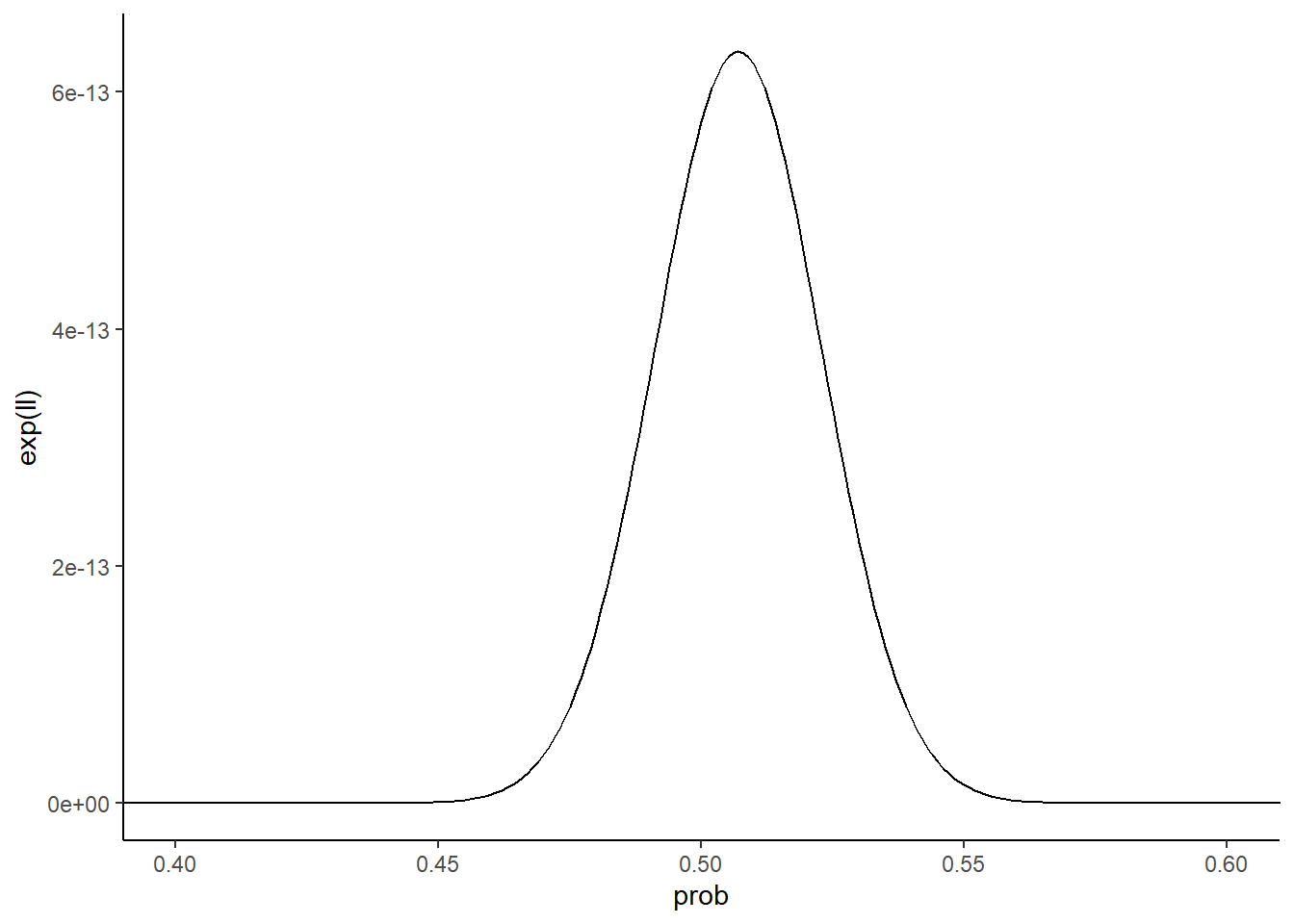
Ldf %>%
  dplyr::filter(size == "big") %>%
  ggplot(aes(x = prob, y = exp(ll))) +
  geom_line() +
  theme_classic() +
  coord_cartesian(xlim = c(0.4, 0.6))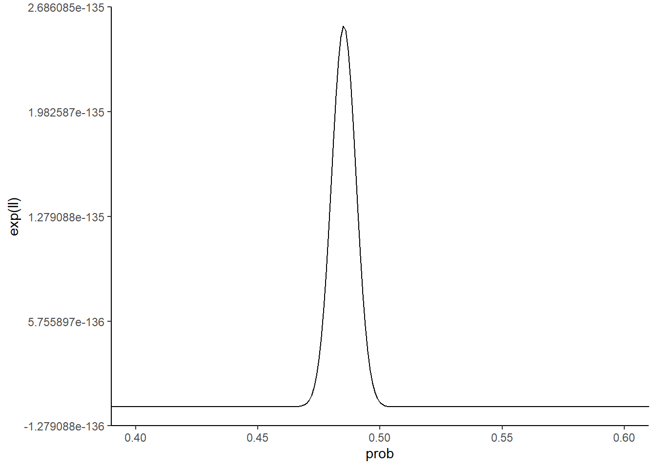
What do you notice about the two likelihood function curves? The small dataset curve is broader than the large dataset curve. Why is this the case? Because with less data, it’s more difficult to distinguish between different parameter values. Seeing 5 heads in 10 flips isn’t all that crazy for a coin with a probability of heads of 0.6 or 0.4. Seeing 50 heads in 100 flips though with that kind of coin is a lot less likely. Collecting more data narrows the space of reasonable parameters.
Thus, intuitively, the sharpness of the likelihood function about its maximum could be a reasonable estimate for our uncertainty. Formalizing this idea takes a good deal of math, but the idea is that calculus provides us with a quantity that describes how sharp a function peaks about its maximum: the second derivative. The second derivative of our likelihood function can be provided by optim() in the form of what is known as the Hessian:
### Step 1: run optim()
fit <- optim(
  par = 0.5, # initial guess for prob
  fn = binom_ll, # function to maximize
  data = simdata, # something passed to the function
  method = "L-BFGS-B", # Most efficient method for finding max,
  lower = 0.001, # Lower bound for parameter estimate
  upper = 0.999, # Upper bound for parameter estimate
  hessian = TRUE # Return the Hessian
  )

### Estimate uncertainty
uncertainty <- sqrt(solve(fit$hessian))


uncertainty
[,1]
[1,] 0.004999884Compare this value with the one we got through bootstrapping. They’re pretty similar!
4.1.2.3 Uncertainty in “higher dimensions”
END OF LECTURE 2
4.1.3 A self-guided exercise: fit a negative binomial
Let’s make this more RNA-seq relevant now. As we will talk about more throughout this course, one of the most common models for the replicate-to-replicate variability of RNA-seq read counts is a negative binomial distribution. In this case, there are two parameters to estimate. In R, they are referred to as mu and prob. Simulate some data with a given value for these two parameters, and follow the steps above to find a strategy that consistently returns accurate estimates for the parameter values you simulated with.
4.1.4 A 2nd self-guided exercise: fit a normal distribution
END OF LECTURE 3
4.2 Problem set
4.2.1 Fitting the wrong model
Explore and document what happens when you simulate using one distribution but fit a normal distribution to the data. How do the mean and standard deviation of your data relate to the estimated mean and sd parameters of the normal distribution? Do this with two non-normal distributions of your choice.