Why collect replicates of the same exact data? The (in)famous definition of insanity, “Doing something over and over again and expecting a different result”, would seem to classify replication as crazy. Except, anyone who has ever collected any kind of data has an intuition for why replication is important: each replicate is always different from the last. Somehow, despite following a precise protocol in a particular lab with the same reagents, pipettes, measuring devices, etc., every replicate yields a slightly different result. There is randomness in your data.
This randomness throws a wrench in naive data analyses. In biology, we are often measuring something (e.g., the concentration of an interesting molecule, the viability of an organism, etc.) in two or more “conditions” (e.g., with and without drug) and assessing whether or not any of our measurements differ from one another. If every replicate of an experiment yielded the same data, this task would be trivial. Just take one measurement in each condition, compare the measurements, and draw conclusions. If the measurements differ, the thing you are measuring differs. If the measurements are identical, the thing you are measuring is unaffected by your perturbations. The randomness of data forces us to consider an alternative conclusion. What if our measurements differ, not because the thing we are measuring is changing, but because our measurements fluctuate from experiment-to-experiment? How do we know what differences are real and what differences are the result of this randomness?
We will start answering this question with the help of probability theory. Probability theory is a field of mathematics that gives us the tools to think about and quantify this randomness. This chapter will introduce you to the key instrument provided by this field: the probability distribution. With this tool, we will be able to describe and better understand the random fluctuations that plague our data.
4 The Many Flavors of Randomness
To understand how statisticians think about randomness, consider an analogy. In biology, everything is complicated and every system we study seems unique. To tackle this complexity, we group things into bins based on important characteristics they share, and then we try to understand the patterns that govern each bin. Bins in biology may be determined by the type of organism being studied (e.g., entymology, mammology, microbiology, etc.), the activities of molecular machines you investigate (e.g., phosphorylating subtrates, regulating transcription, intracellular transport, etc.), and much more. Similarly in statistics, every kind of data seems to possess unique sources and types of variance. Work with enough data though and you will notice that there are patterns in the types of randomness we commonly see. We thus focus on understanding these common patterns and apply them to understanding our unique data.
The patterns in randomness that we observe are coined “probability distributions”. Think of them as functions, which take as input a number, and provide as output the probability of observing that number. These functions could take any shape you dream up, but as mentioned, particular patterns crop up all of the time. In the following exercises, we are going to explore these patterns and understand what gives rise to them.
4.1 The basics
To illustrate some general facts about randomness, we will start by working with two functions in R: rbinom() and rnorm(). These are two of many “random number generators” (RNGs) in R. As we will learn in these exercises, there isn’t just one kind of randomness, so there isn’t just one RNG.
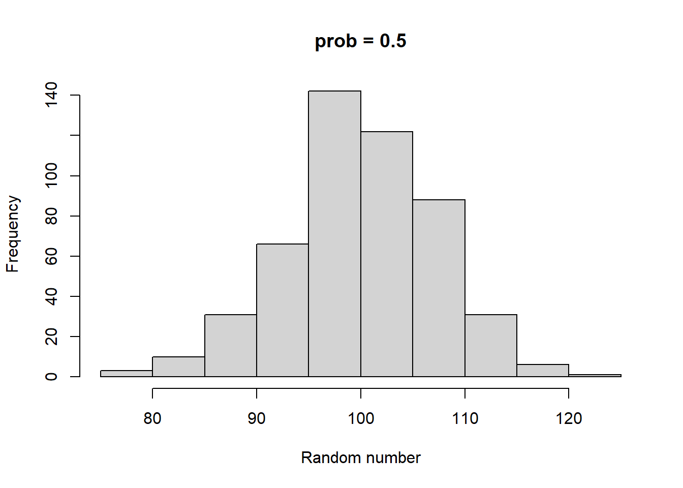
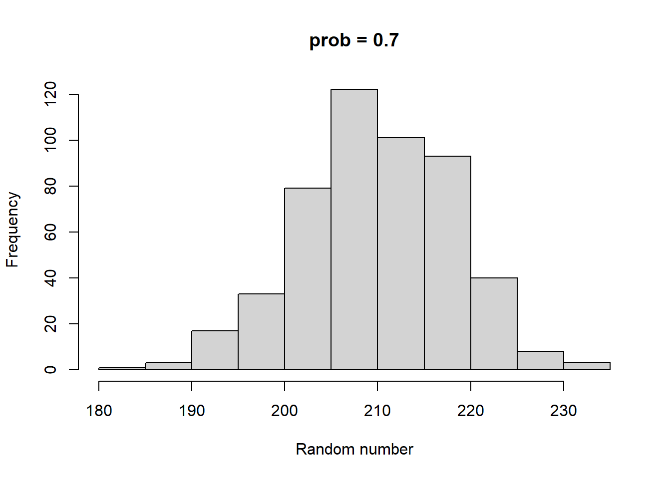
rbinom and rnorm both have 3 parameters. Both have a parameter called n, which sets the number of random numbers to generate. rbinom has two other parameters called size and prob. size can be any integer >= 0. prob can be any number between 0 and 1 (including 0 and 1). rnorm’s two additional parameters are called mean and sd. mean can be any number, and sd can be any positive number. Take some time to play with both of these functions. As you do so, consider the following:
In what ways are their output similar?
In what ways are their output distinct?
How do prob and size impact the output of rbinom?
How do mean and sd impact the output of rnorm?
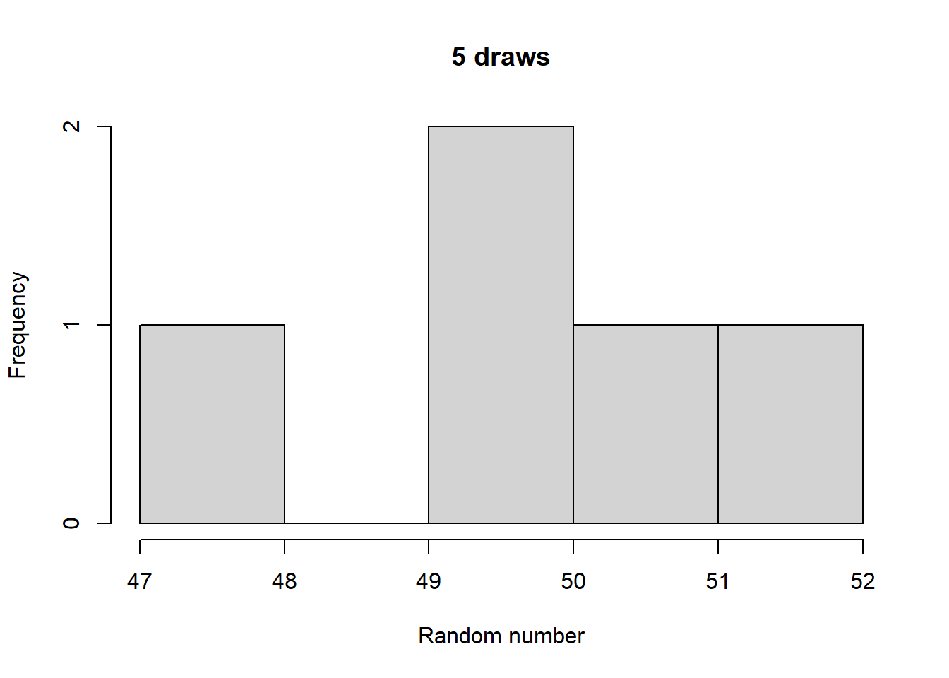
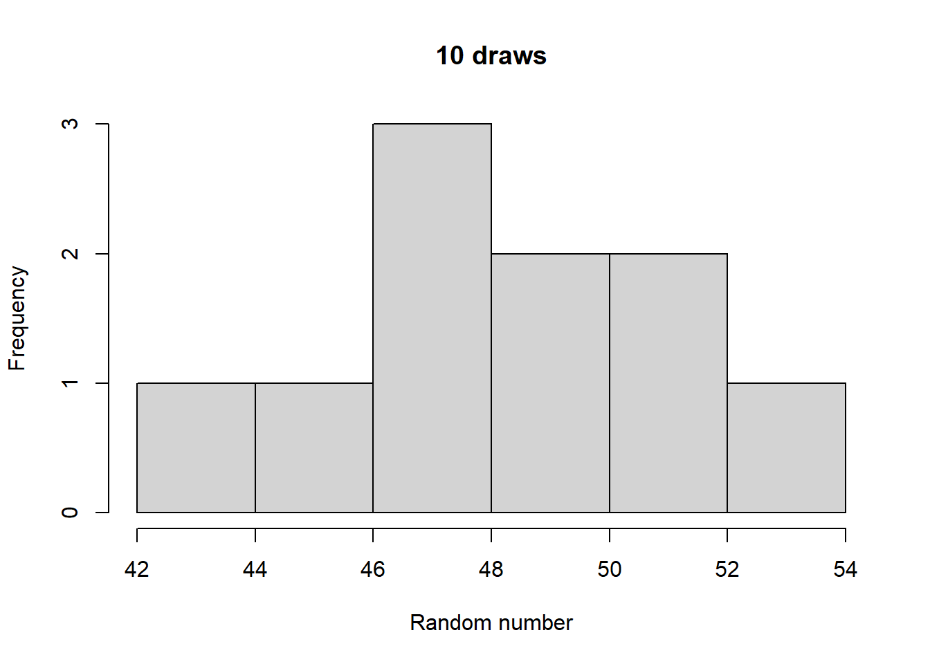
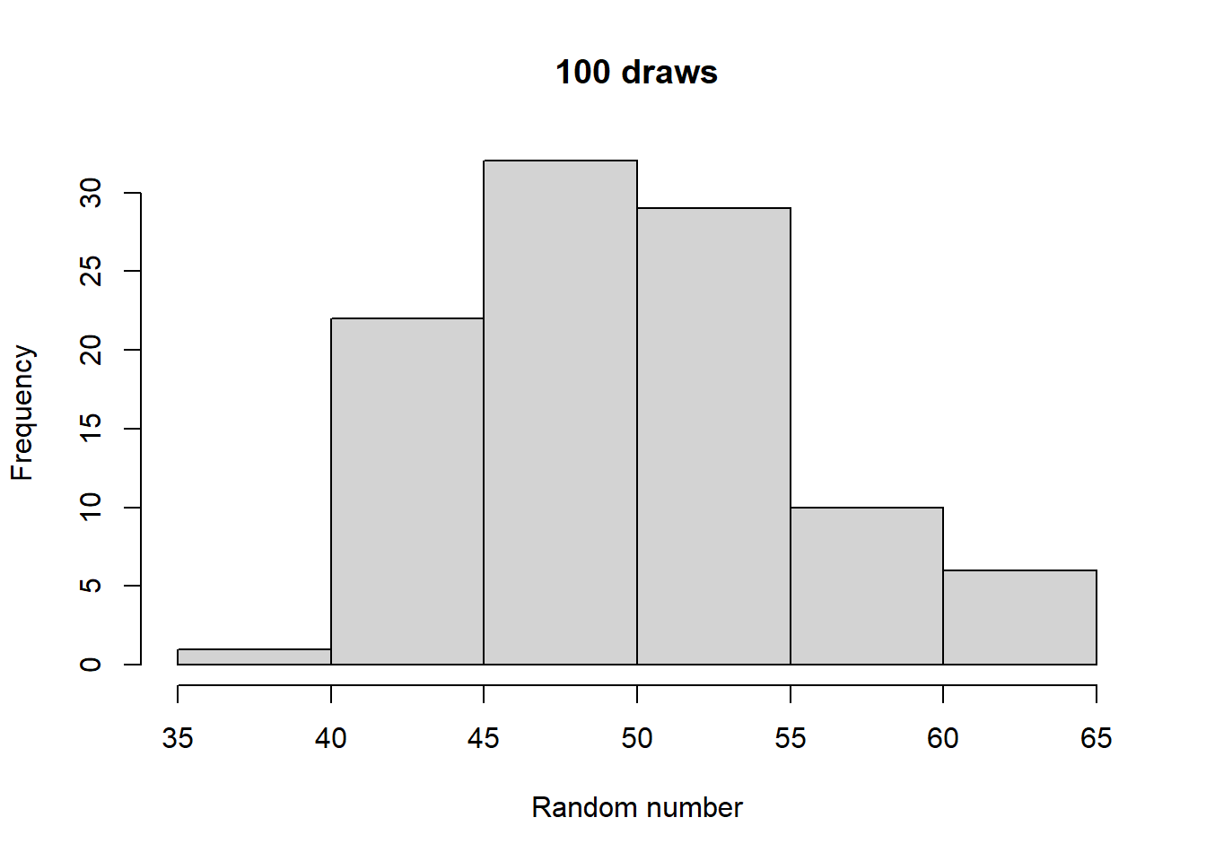
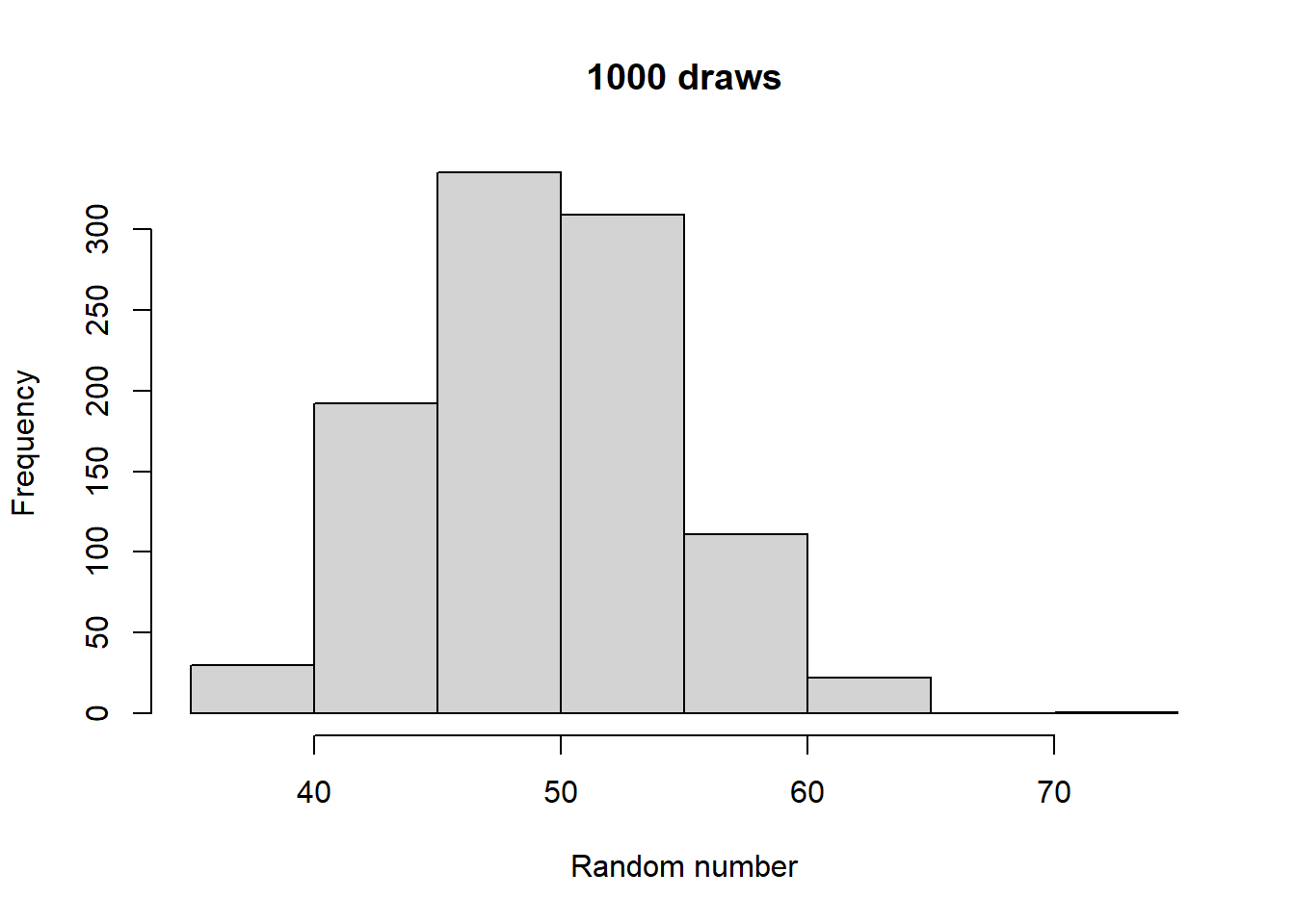
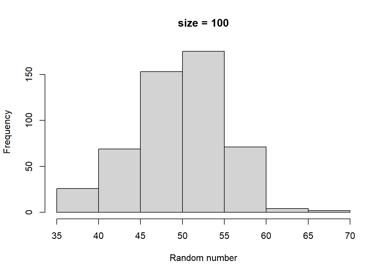
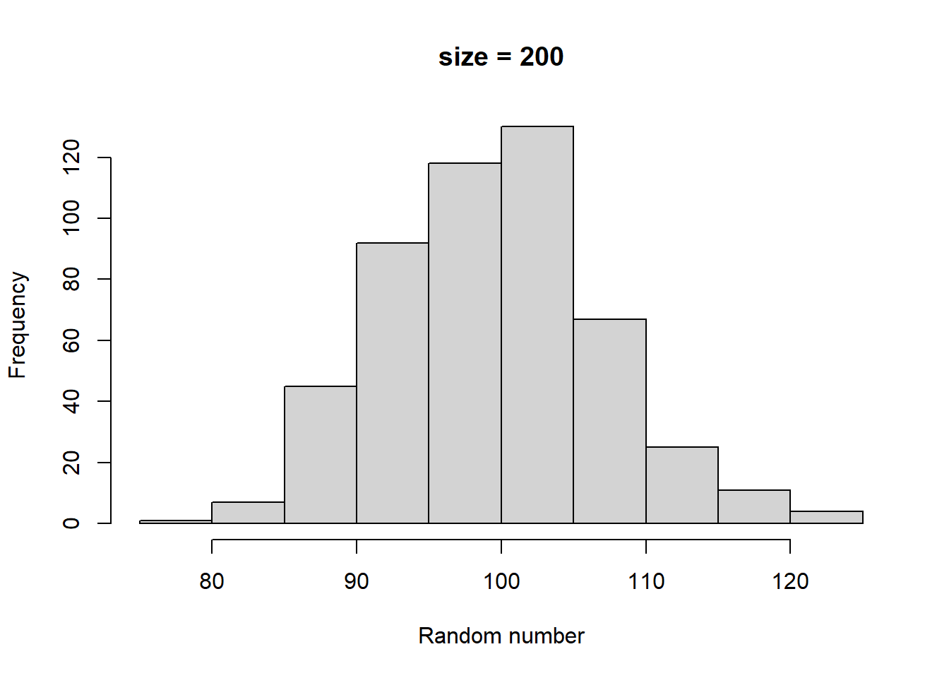
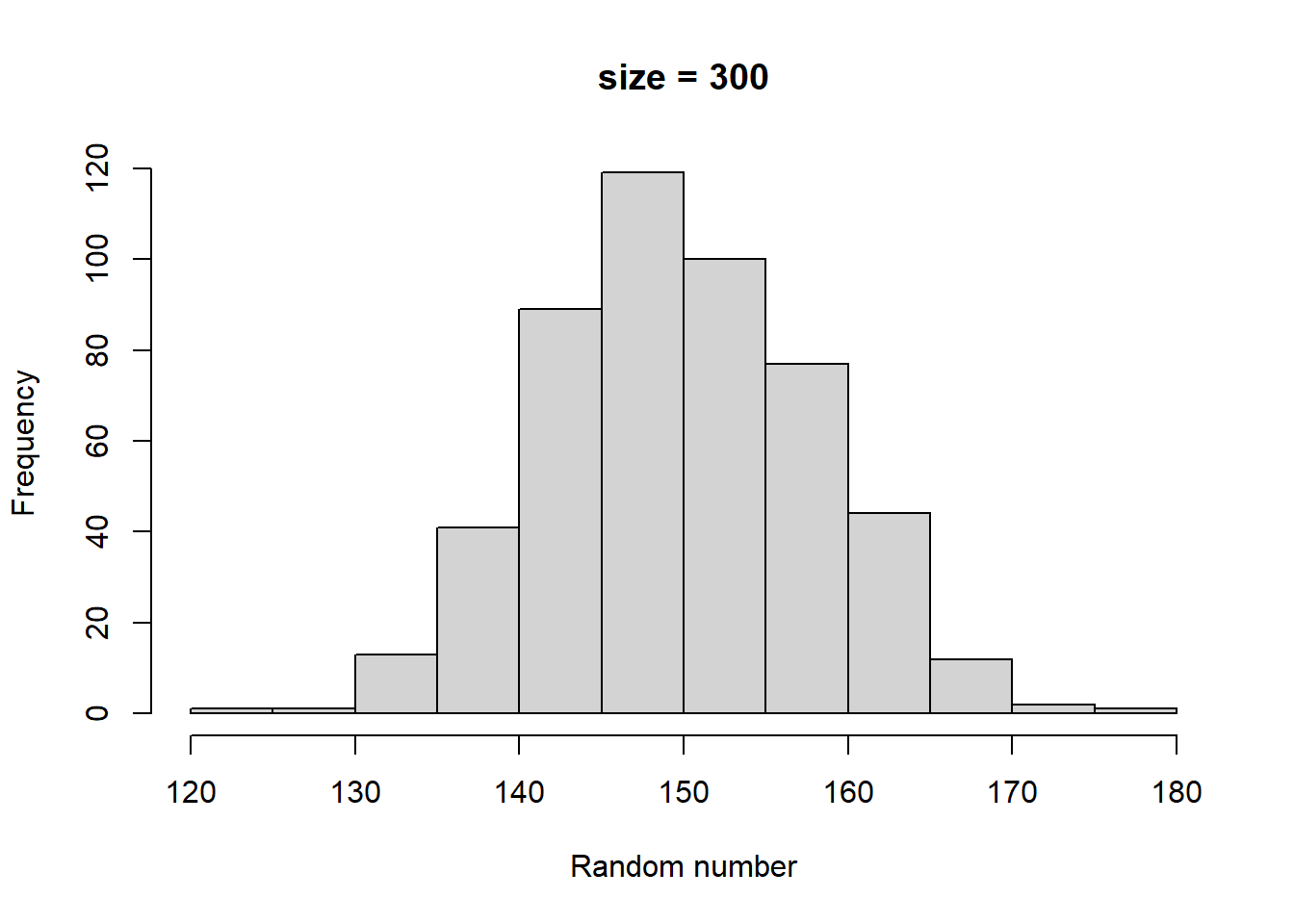
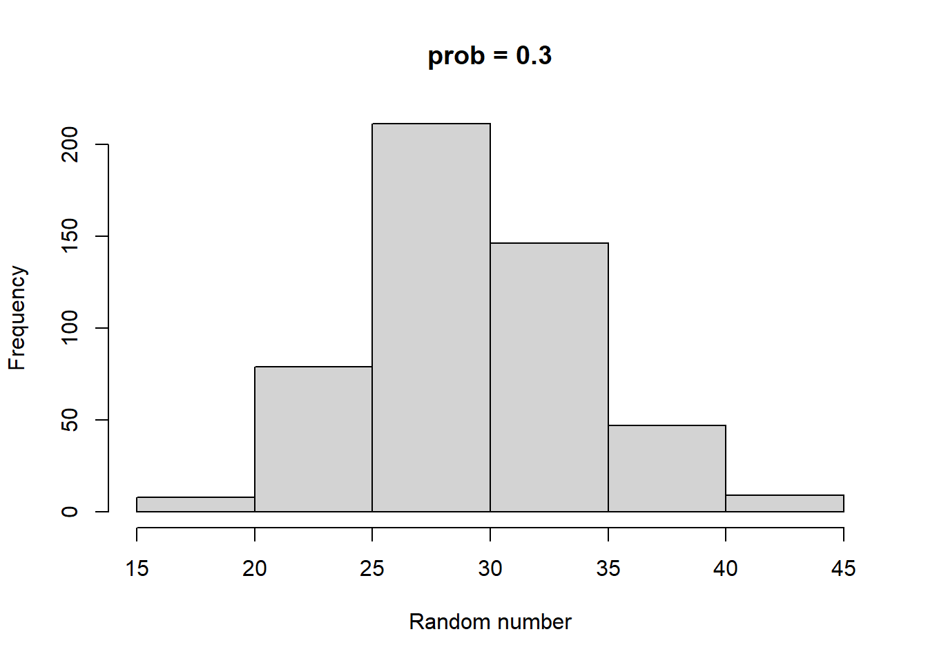
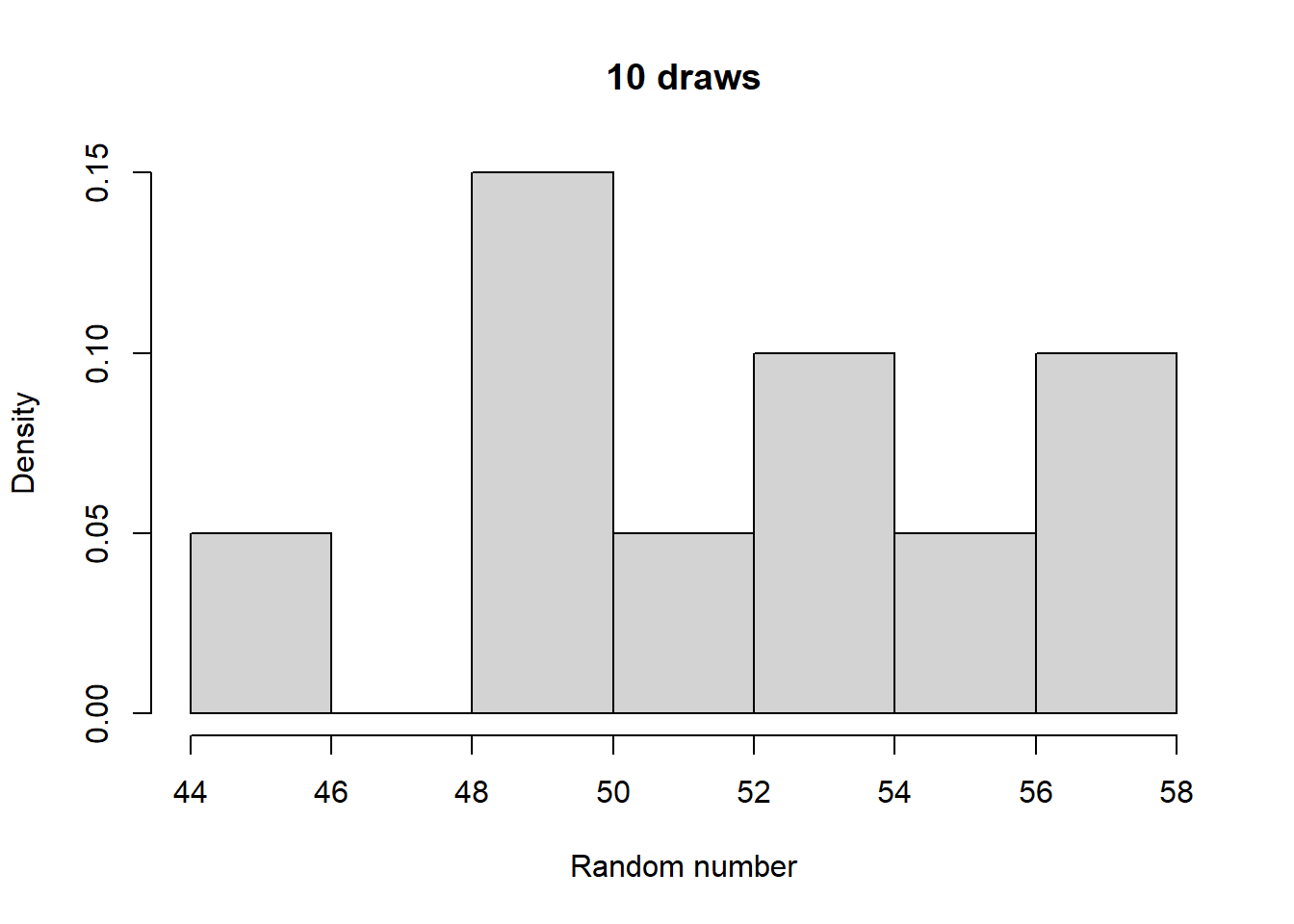
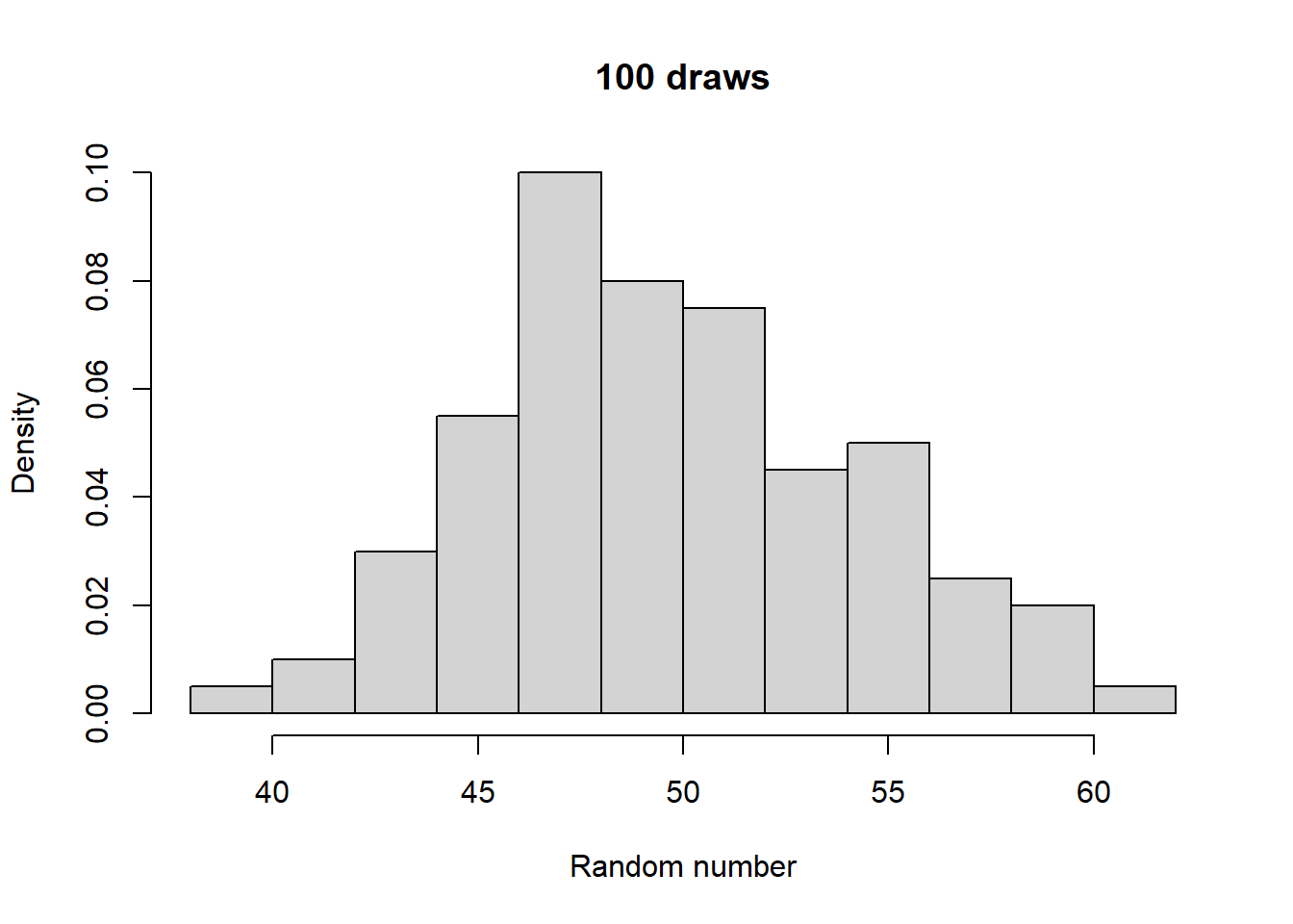
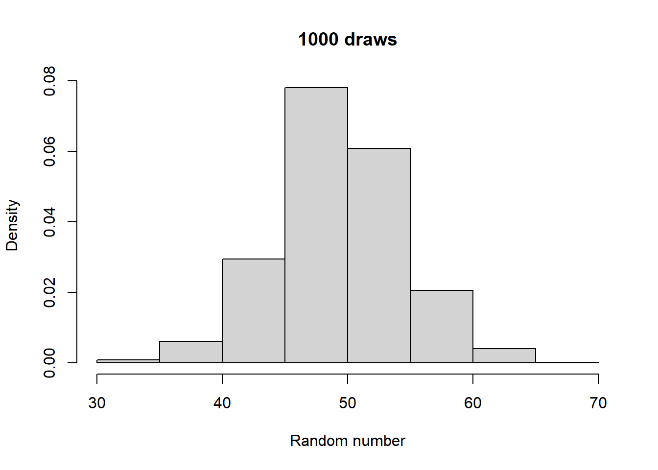
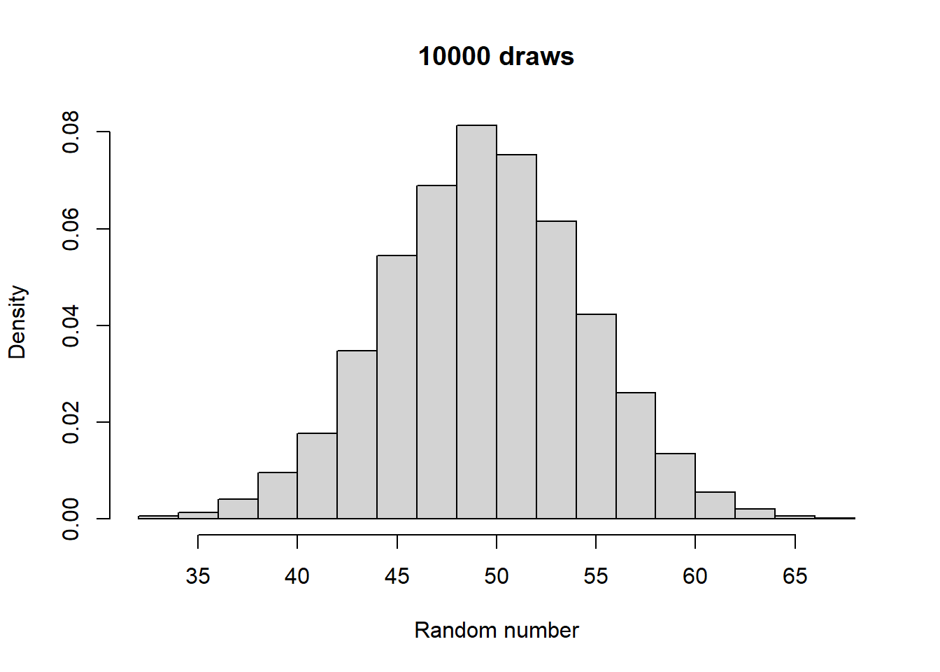
Make histograms with different numbers of random numbers (i.e., different n). What do you see as n increases? Now repeat this but with different parameters for the relevant function. What changes?
4.1.1 Example exercise:
Generated 5 draws from each to compare general output:
Higher size generates larger random numbers. In fact, distribution of random numbers seems to increase in proportion to increase in size (i.e., doubling size doubles the average random number generated)
Higher prob has a similar effect to higher size, increasing the average magnitude of random numbers generated. There also seems to be a similar linear proportionality.
4.1.2 Takeaways
There are two kinds of randomness: discrete and continuous.
Discrete randomness is randomness where the output can be described with integers.
Continuous randomness is randomness where the output can be described with real numbers.
Randomness is described by its patterns. Any individual data point may be random but collect enough of them from a given process/source and a pattern will emerge. Some values are more likely to occur, some are less likely, and some may even never occur.
4.1.3 Properties of random variables
4.1.3.1 Mean
The mean of a distribution is a measure of its “central tendencies”. Usually, values closer to the mean are more common than values further away from the mean. The mean of a set of random numbers can be calculated in R using the mean() function:
b <-rbinom(100, size =100, prob =0.5)n <-rnorm(100, mean =5)mean(b)
[1] 50.44
mean(n)
[1] 4.934015
Because of the randomness inherent in RNGs, the mean that you will get for any finite sample will often vary from sample to sample:
Every distribution has some inherent mean given its set of parameters. You can think of this as the mean you would get if you took a really large sample. For example, the mean parameter in rnorm is exactly this large sample mean. You can see how the mean of a given sample tends to gets closer to this value as you increase the sample size:
n10 <-rnorm(10, mean =5)n100 <-rnorm(100, mean =5)n1000 <-rnorm(1000, mean =5)mean(n10)
[1] 4.821242
mean(n100)
[1] 4.999382
mean(n1000)
[1] 4.949294
You can calculate the mean yourself with some simple R code; it is the sum of all your data points divided by the number of data points:
n100 <-rnorm(100, mean =5)mean(n100)
[1] 4.867501
sum(n100)/length(n100)
[1] 4.867501
For any distribution, you can look up its mean (as well as the other properties discussed below) on sites like Wikipedia:
A key feature of randomness is the amount of variability from outcome to outcome of a random process. As we will see when we start using models of data randomness to draw conclusions about said data, figuring out how variable our data is represents a key challenge.
We often describe the variability of a random sample using the variance and standard deviation. These can be calculated in R using the var and sd functions, respectively:
b <-rbinom(100, size =100, prob =0.5)n <-rnorm(100, mean =5)sd(b)
[1] 4.742501
sd(n)
[1] 1.071113
var(b)
[1] 22.49131
var(n)
[1] 1.147282
Close inspection will reveal that the output of var is just the output of sd squared:
b <-rbinom(100, size =100, prob =0.5)n <-rnorm(100, mean =5)sd(b)^2
[1] 25.61
var(b)
[1] 25.61
sd(n)^2
[1] 0.6860808
var(n)
[1] 0.6860808
The variance measures the squared distance of each data point from the mean, and sums up all of these squared distances:
b <-rbinom(100, size =100, prob =0.5)n <-rnorm(100, mean =5)var(b)
[1] 27.74657
sum( ( b -mean(b) )^2 )/(length(b) -1)
[1] 27.74657
var(n)
[1] 0.6872376
sum( ( n -mean(n) )^2 )/(length(n) -1)
[1] 0.6872376
Why the square? When assessing variability, we don’t care if data is above or below the mean, so we want to score data points greater than the mean equally to how we score those below the mean. The square of the mean - 1 is the same as the square of the mean + 1, and both are positive values, because squaring a real number always yields a positive number. Why not the absolute value? Or the fourth power of the distance to the mean? Or any other definitively positive value? Convenience and mathematical formalism. In other words, don’t worry about it.
NOTE: EXTRA DETAIL ALERT
The other mystery of the calculation of the standard deviation/variance is the fact that the sum of the deviations from the mean are divided by the number of data points minus 1, rather than just the number of data points, as in the mean. Why is this? Again, mathematical formalism, but there is an intuitive explanation to be discovered.
When calculating the mean, each data point is its own entity that contributes equally to the calculation. I can’t calculate the mean without all n data points. When calculating the standard deviation though, each data point is compared to the mean, which is itself calculated from all of the data points.
If I tell you the mean though, I only need to tell you n - 1 data points for you to infer the final data point. For example, if I have 3 numbers that I tell you average to 2, and two of them are 1 and 3, what is the third? It has to be 2. Thus, when calculating the distance from each point to the mean, there are only n - 1 unique pieces of information. I tell you n - 1 data points and the mean, and you can tell me the standard deviation (since you can infer the missing data point). We say that there are “n - 1 degrees of freedom”. Thus, the effective average of the differences from the mean are all of the squared differences divided by n - 1, the number of “non-redundant” data points that remain after calculating the mean.
END OF THE EXTRA INFO ALERT
4.1.3.3 Higher order “moments” (BONUS CONTENT)
The mean and the variance are related to what are called (who knows why) moments of a distribution. A moment is the average of some function of the random data. For example, the mean is the average of the data itself, which you could call data passed through the function f(x) = x. The variance is related to this moment, as well as the so-called second moment, which is the average of the square of the random data (f(x) = x^2). In fact, this leads to an equivalent way to calculate the variance:
b <-rbinom(100, size =100, prob =0.5)n <-rnorm(100, mean =5)var(b)
[1] 23.59788
mean(b^2) -mean(b)^2
[1] 23.3619
var(n)
[1] 0.9543932
mean(n^2) -mean(n)^2
[1] 0.9448493
Well not fully equivalent, but they get closer to one another as the sample size increases:
n100 <-rnorm(100, mean =5)n1000 <-rnorm(1000, mean =5)n10000 <-rnorm(10000, mean =5)
n = 100:
var(x):  1.031447
(x^2) - mean(x)^2:  1.021132

n = 1000:
var(x):  1.009487
(x^2) - mean(x)^2:  1.008477

n = 10000:
var(x):  0.993944
x^2) - mean(x)^2:  0.9938446
Various other moments or functions of moments enjoy some level of popularity in specific circles. We won’t talk about them here, but you’ll see them on Wikipedia sites for distributions, things like the “skewness” and “excess kurtosis” are examples of these additional moments, or functions of moments.
4.1.3.4 Density/mass functions
Earlier, I said “Think of [probability distributions] as functions, which take as input a number, and provide as output the probability of observing that number”. Fleshing out what I mean by this will help you understand one of the key concepts in probability theory: probability density/mass functions.
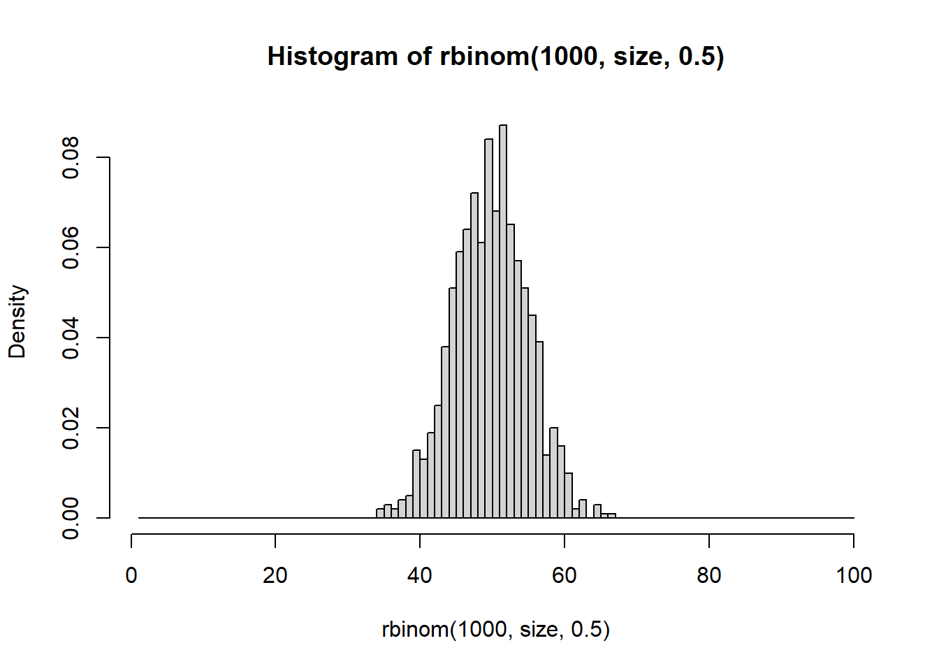
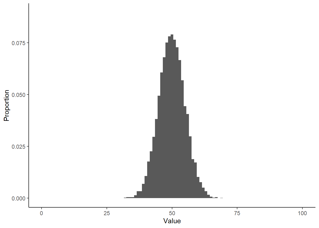
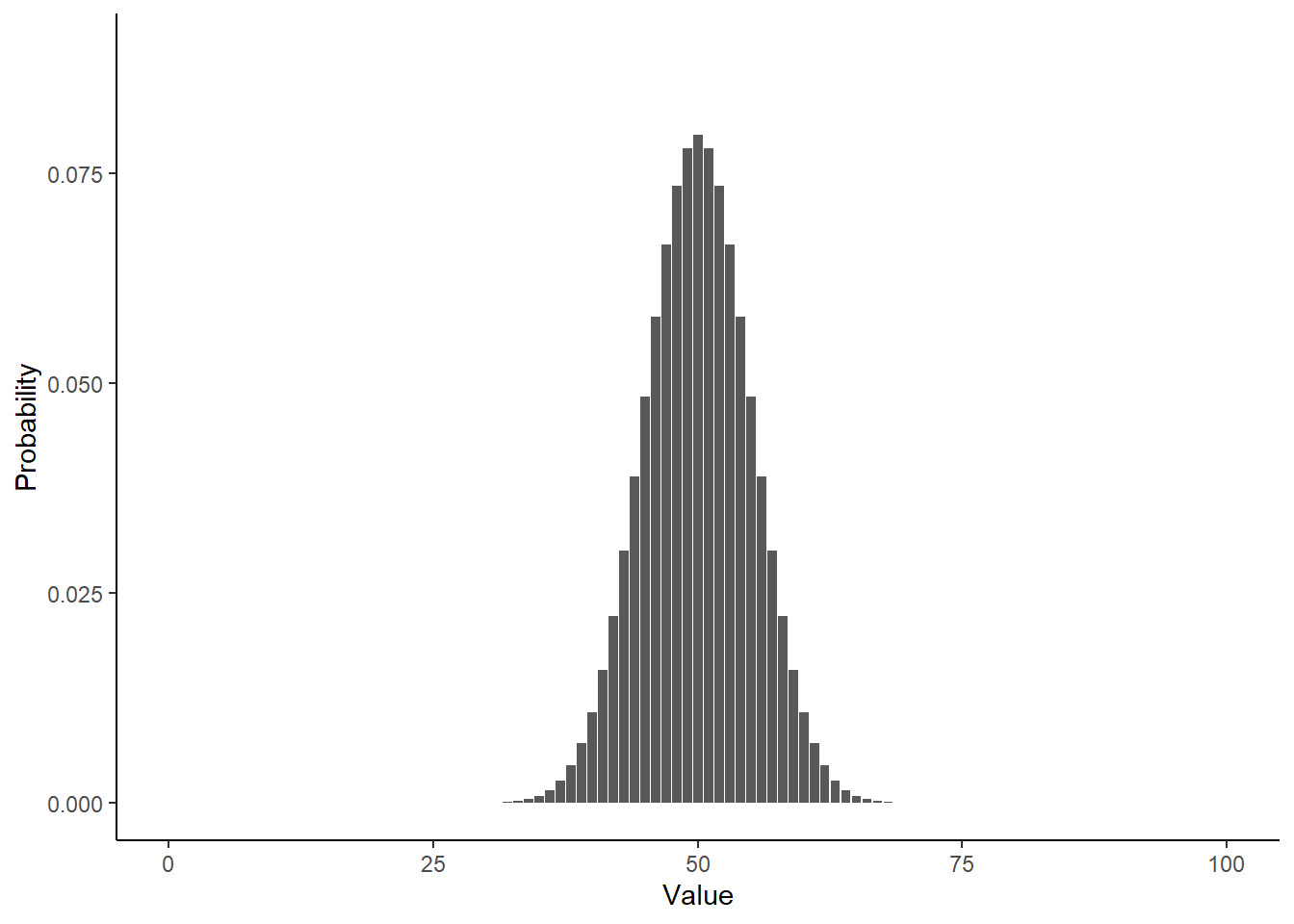
Take a look at what a normalized histogram of draws from rbinom() looks like as we increase n. “Normalized” here means that instead of the y-axis representing the number of draws in a given bin (what is plotted by hist() by default), it is this divided by the total number of draws.
As you increase n, a pattern begins to emerge. The y-axis is the fraction of the time a random number ended up in a particular bin. It can thus be interpreted as the probability that the random number falls within the bounds defined by that bin. What you may notice is that these probabilities seem to converge to particular values as n gets large. This pattern of probabilities is known as the binomial distributions “probability mass function”. If the output of the RNG is continuous real numbers, then this is referred to as the “probability density function”.
For all of the distributions that we can draw random numbers from in R, we can similarly use R to figure out its probability mass/density function. The function will have the form d<distribution>, where d denotes density function:
dbinom(x =50, size =100, prob =0.5)
[1] 0.07958924
dbinom(x =10, size =100, prob =0.5)
[1] 1.365543e-17
dbinom(x =90, size =100, prob =0.5)
[1] 1.365543e-17
dbinom(x =110, size =100, prob =0.5)
[1] 0
dbinom(x =50.5, size =100, prob =0.5)
Warning in dbinom(x = 50.5, size = 100, prob = 0.5): non-integer x = 50.500000
[1] 0
4.1.3.4.1 Exercise
Prove to yourself that dbinom yield probabilities similar to what you saw in your normalized histograms.
Hint:
### Make bins of size 1 so as to match up more cleanly with `dbinom()`# Maximum valuesize <-100# Plot with bin size of 1hist(rbinom(1000, size, 0.5), freq =FALSE, breaks =1:size)
EXAMPLE EXERCISE:
library(ggplot2)library(dplyr)
Warning: package 'dplyr' was built under R version 4.3.2
Attaching package: 'dplyr'
The following objects are masked from 'package:stats':

    filter, lag
The following objects are masked from 'package:base':

    intersect, setdiff, setequal, union
In the case of discrete random variables, this exercise shows that the output of d<distribution>() has a clear interpretation: its the probability of seeing the specified value given the specified distribution parameters. In the case of continuous random variables though, the interpretation is a bit trickier. For example, consider an example output of dnorm():
dnorm(0, mean =0, sd =0.25)
[1] 1.595769
It’s greater than 1! How could a probability be greater than 1?? The answer is that the output isn’t a probability in the same way as in the discrete case. All that matters for this class is that this number is proportional to a probability. The distinction here is a bit unintuitive, but there are some great resources for fleshing out what this means. See for example 3blue1brown’s video on the topic.
BEGINNING OF BONUS CONTENT
Here I will briefly explain what the output of dnorm() represents.
The output of dnorm() represents a “probability density”, hence the name “probability density function”. What is a “probability density”? The analogy to an object’s mass and density is fitting. If you want to get something’s mass given its density, you need to multiply its density by that object’s volume. To get probability (mass) from a density (output of dnorm()) you need to specify how large of a bin to consider.
dnorm(0, mean =0, sd =0.25)*0.001
[1] 0.001595769
This can be interpreted as the probability of a number generated by rnorm() falling between -0.0005 (i.e., 0 - 0.001/2) and 0.0005. This is only an approximation, as the density (output of dnorm()) is not constant between -0.0005 and 0.0005:
dnorm(-0.0005, mean =0, sd =0.25)
[1] 1.595766
dnorm(0, mean =0, sd =0.25)
[1] 1.595769
Choose a small enough bin though, and it will be pretty close to the probability of a number ending up in that bin. The exact answer to this question comes from integrating the probability density function within the bin of interest:
\(\text{P(x} \in [L, U]\text{)}\) should be read as “the probability that a random variable x drawn from rnorm() falls between \(L\) and \(U\)”.
!!END OF LECTURE 1!!
4.2 Discrete random variables
4.2.1 Modeling two outcomes: the binomial distribution
You have already played around with the binomial distribution, as that is the name given to the distribution of numbers generated by rbinom. Now it is time to tell its story. All distributions have a story, or rather, a generative model. A generative model is a process that would give rise to data following a particular distribution.
The binomial’s story goes like this: imagine you have an event that can result in two possible outcomes. For example, flipping a coin (an event) can result in either a heads or a tails (two possible outcomes). One thing has to be true about this process for it to be well described by a binomial distribution: the probability of a particular outcome must be exactly the same from event to event. For example, if every time you flip a coin, it has a 50% chance of coming up heads and a 50% chance of coming up tails, then the number of heads is well described by a binomial distribution.
The size parameter in the rbinom function sets the number of events you want to simulate. The prob parameter sets the probability of an outcome termed the “success”. Success here has a misleading connotation; it might represent an outcome you are happy about, it might represent an outcome that you displeased by, it might represent an outcome that you are completely indifferent to. Statisticians name things in funny ways…
4.2.1.1 Exercise
Take some time to explore the properties and output of rbinom(). Questions to consider include:
How does the mean depend on size?
How does the mean depend on prob?
How does the variance depend on size? prob?
What is the most likely outcome for a given size and prob?
What is an aspect of RNA-seq data that you could model with a binomial distribution?
4.2.1.2 Example exercise:
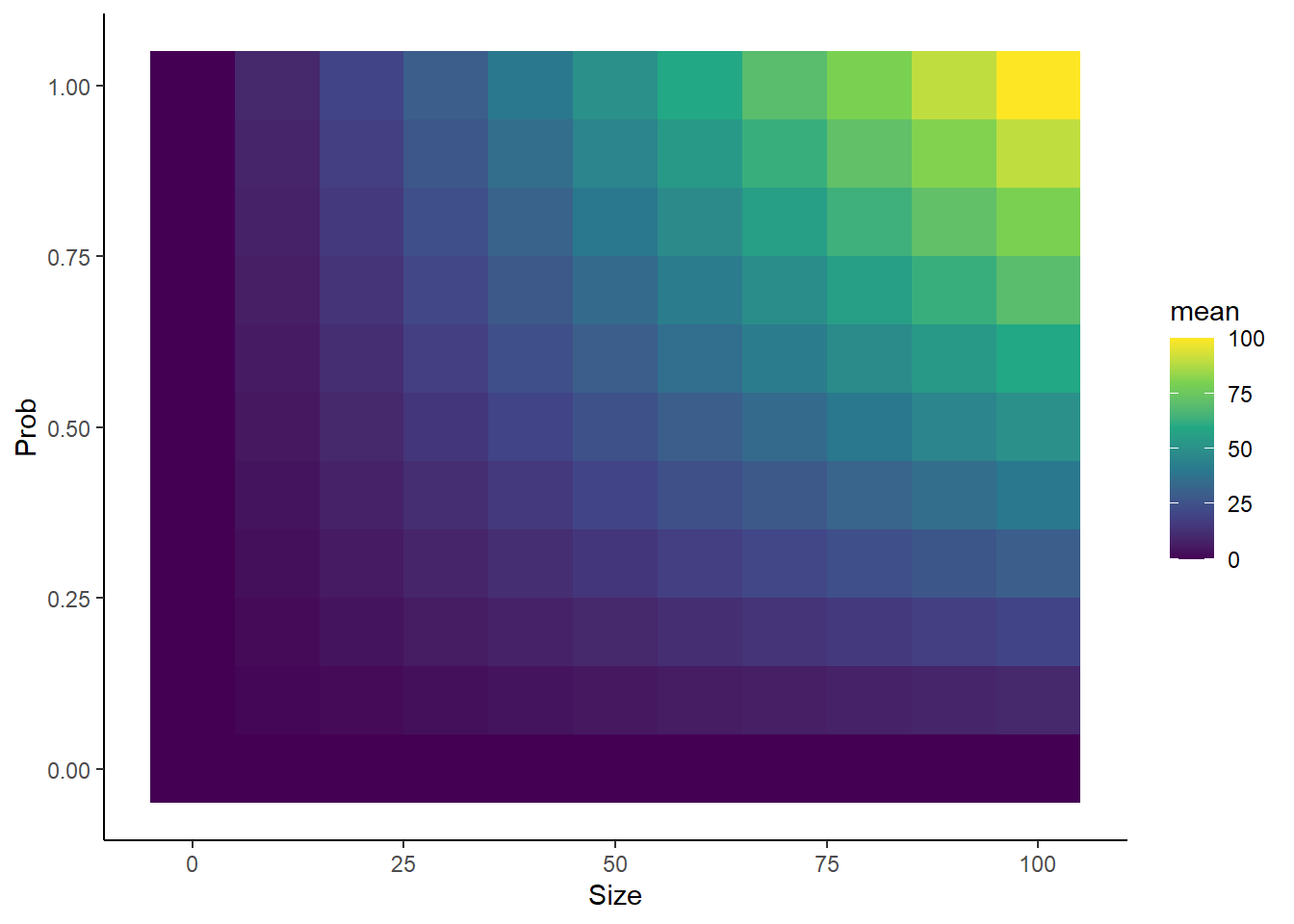
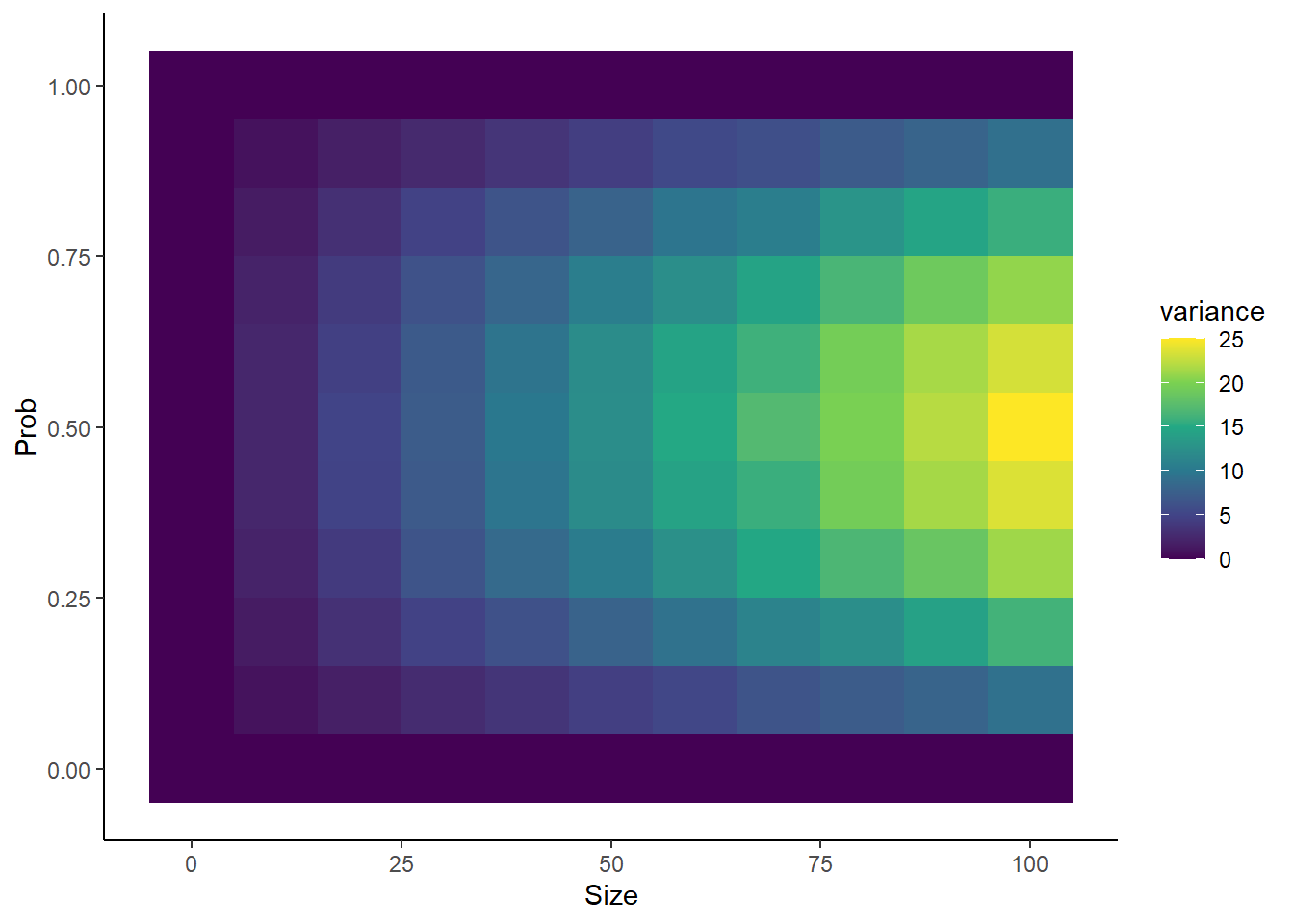
Going hardcore: inspect properties of distribution as function of size and prob
library(dplyr)library(ggplot2)nsims <-5000probs <-seq(from =0, to =1, by =0.1)sizes <-seq(from =0, to =100, by =10)Lp <-length(probs)Ls <-length(sizes)means <-rep(0, times = Lp*Ls)vars <- meanscount <-1for(p inseq_along(probs)){for(s inseq_along(sizes)){ simdata <-rbinom(nsims, size = sizes[s], prob = probs[p]) means[count] <-mean(simdata) vars[count] <-var(simdata) count <- count +1 }}sim_df <- dplyr::tibble(prob =rep(probs, each = Ls),size =rep(sizes, times = Lp),mean = means,variance = vars) sim_df %>%ggplot(aes(x = size, y = prob, fill = mean)) +geom_tile() +scale_fill_viridis_c() +theme_classic() +xlab("Size") +ylab("Prob")sim_df %>%ggplot(aes(x = size, y = prob, fill = variance)) +geom_tile() +scale_fill_viridis_c() +theme_classic() +xlab("Size") +ylab("Prob")
Observations:
Confirms that higher size and prob = higher average number
Interesting to see that variance increases as a function of size, but that prob = 0.5 leads to the highest variance.
Setting prob to 0 or 1 causes variance to go exactly 0, regardless of what size is set to. Similarly, setting prob to 0 causes the mean to go to exactly 0, regardless of what size is set to.
4.2.2 Modeling > 2 outcomes: the multinomial distribution
When exploring the binomial distribution, we considered data with two possible outcomes. What if many of the same assumptions hold, but there are now more than 2 possible results? That is where the multinomial distribution comes in.
Generative model: Imagine you have an event that can result in one of N outcomes, where N is some integer. Each outcome has some probability, p_{i} (i denoting the ith outcome, for i between 1 and N, inclusive) of occurring, and all of the p_{i} remain constant from event to event.
Example case: When rolling a die, there are 6 outcomes of what number shows face up when the die stops rolling (1, 2, 3, 4, 5, or 6). If each face is equally likely to show up with each roll, then p_{i} = 1/6 for all i. This can be simulated in R with rmultinom():
The output will be a matrix with n columns and number of rows equal to the length of prob. The value in the ith row and jth column is the number of times event i was observed in simulation j. In this case, the rows can be interpreted as the number a die came up, and each columns represents the result of a single role of a single die.
4.2.2.1 Exercise
Use rmultinom() and a bit of ancillary code to simulate the sequence of an RNA produced from a gene. This doesn’t need to be a real gene, just a random sequence of nucleotides. Then determine some features of this sequence:
What is the longest run of each nucleotide in a row?
What is the least common nucleotide in your sequence?
What is the most common nucleotide in your sequence?
How different is the rate of occurence of the least and most common nucleotides
4.2.2.2 Example exercise
### Parameters for simulation# Number of nucleotides in RNAlength <-25# Nucleotide proportionsATprop <-0.4CGprop <-0.6### Generate random nucleotidesnucleotides <-rmultinom(length, size =1,prob =c(ATprop/2, ATprop/2, CGprop/2, CGprop/2))### Determine sequencenucleotide_types <-c("A", "U", "C", "G")nucleotide_ids <-1:4# Cute matrix algebra trick# IDs will be row ID for which value of matrix was 1IDs <-t(nucleotides) %*%matrix(1:4, nrow =4, ncol =1)sequence <-paste(nucleotide_types[IDs], collapse ="")print(sequence)
[1] "CUCCUUGACAGUGAACGUCGGCGUG"
4.2.3 Modeling “counts”: the Poisson distribution
As we have seen, RNA-seq data can be summarized as a matrix of read counts. Read counts are the number of times that we observed an RNA fragment from a particular genomic feature. What then, is a good model for the number of read counts for a particular feature? Enter a major contender: the Poisson distribution
Generative model: Imagine that “events” are independent, that is the time since the last event or how many such events have already occurred have no bearing on how likely we are to see another event. The number of such events in a particular period of “time” (time here in quotes as time could represent units like “number of RNA fragments sequenced”) will be Poisson distributed.
4.2.3.1 Exercise
Explore the output of rpois(), the Poisson distribution random number generator. Besides the typical n parameter, it has only one other parameter, lambda. Investigate the impact of changing lambda.
Compare the amount of variability in rpois() output to the amount of variability in a real RNA-seq dataset.
4.2.4 Modeling time to first “success”: the geometric distribution
The binomial distribution provides a great model for the number of “successes” in a set of random, binary outcomes. What if we were interested in how long we will have to wait until the first success though? That is where the geometric distribution comes into play.
Generative Model: Like with the binomial distribution, imagine you have an event that can result in two possible outcomes, and the probability of a particular outcome is exactly the same from event to event. The number of events until you see until the first success will follow a geometric distribution.
4.2.4.1 Exercise
Explore the output of rgeom(), the geometric distribution random number generator. Besides the typical n, it has only one additional parameter, prob, which can be a number between 0 and 1.
Use rbinom() and a bit of custom R code to create your own rgeom() alternative, and confirm that the average value given by your simulator and rgeom() for a given prob is approximately equal.
4.2.5 Modeling time to nth “success”: the negative binomial distribution
The geometric distribution describes the time until the first success of a binary outcome. What if we need to model the time to the nth success, where n is any integer > 1? For that, we can look to the negative binomial distribution.
Generative Model: Like with the binomial distribution, imagine you have an event that can result in two possible outcomes, and the probability of a particular outcome is exactly the same from event to event. The number of events until you see until the nth success will follow a negative binomial distribution.
Spoiler alert: We’ll see the negative binomial later, but it will take on a very different character, acting as a generalization of the Poisson distribution rather than of the geometric distribution. This just goes to show that these distributions can wear many hats and will often have many distinct back stories.
4.2.5.1 Exercises
Explore the output of rnbinom(). In addition to the standard n, you should play around with the two rnbinom() unique parameters relevant to the generative model laid out above: size (number of successes) and prob (probability of a success).
Create your own rnbinom() simulator using rbinom() and some custom R code. Compare the properties of your simulator and rnbinom() to ensure things are working as expected.
4.2.6 Sampling without replacement: the hypergeometric distribution
The last major discrete distribution to discuss is the hypergeometric distribution. Every single distribution we have looked at thus far has an assumption of event-to-event independence. That is, no matter what has happened previously, the probability of future events is unwaivering. Can you imagine any case where this might not be true?
The simplest way to violate this assumption is to consider the process of “sampling without replacement”. Say you have a bag of marbles of two colors, black and red. Now imagine that you draw one from the bag, assess its color. What distribution describes the number of black marbles you see? If each time you draw a marble, you subsequently return it to the bag, then the number of black marbles would be well modeled as binomially distributed. This would be called “sampling with replacement”, and it yields independence between each draw. The contents of the bag never changes so neither do the probabilities of a particular result. What if you DIDN’T return each marble though? This would be called “sampling without replacement”, and now the result of the last draw matters, because it affects how likely each outcome is in the next draw. Describing the number of black marbles in this case requires a new distribution: the hypergeometric distribution.
4.2.6.1 Exercise
Explore the output of rhyper. Its parameters are nn (what is referred to as n in all of the obther r<dist>() functions), m (think of this as the number of red marbles), n (think of this as the number of black marbles), and k (think of this as the number of marbles drawn from the bag).
!!END OF LECTURE 2!!
4.3 Continuous random variables
Up until now, we have focused on describing “discrete randomness”. This means that outcomes of the processes that we considered had to be well described with integers (0, 1, 2, …). Not everything in the world fits this description though. Consider the following types of data/processes we could imagine modeling:
The heights of college-aged students
The probability of contracting COVID
In these cases, the outcome is best described using a real number, that is a number which can have an arbitrary number of decimal places. We refer to these as “continuous random variables”, and in this lecture we will familiarize ourselves with the most popular distributions for modeling such processes.
4.3.1 Pure randomness: the uniform distribution
What’s the first thing that comes to mind when you hear that something is “random”? At this point, you should be conditioned to start thinking about the underlying generative model and the distribution that could describe said randomness, but what if you had been asked about randomness embarking on this class? I would argue that for most people, the default definition of randomness is “pure randomness”: every possible event is equally likely. While this class should ensure this is no longer your default, there are plenty of processes that are well described by this sort of randomness. For those cases, we have the uniform distribution.
Generative model: Imagine the output of a process can be described as a real number between a and b. If all values between a and b are equally likely, then this process’ output will be well modeled with a uniform distribution
4.3.1.1 Exercise
Explore the output of runif(). It has 3 parameters of note. The first is the same for all RNGs and is called n. It represents the number of random numbers it spits out. The other two are called min and max. Both of these can be any number you want, as long as min <= max. Generate some random numbers with runif and observe there properties.
4.3.2 Generalizing the uniform distribution
4.3.2.1 Exercises
Explore the output of rbeta(). Check out ?rbeta() to see what parameters exist.
Combine rbeta() and rbinom(), using the former to simulate values of p for the latter. Compare this to rbinom() with prob = shape1 / (shape1 + shape2). How are they similar? How do they differ?
4.3.3 Modeling the time until an event: the exponential distribution
4.3.3.1 Exercises
Explore the output of rexp(). Check out ?rexp() to see what parameters exist.
Compare the following distributions:
The full output of a run of rexp() with a large n, like 100,000
That same output, but subtracting the first quartile from all of the values, and throwing out any negative values. You can find what the first quartile is with quartile().
Do the same thing as in 2 but with the output of rbeta(). Do you get the same result as in 2?
Do the same thing as in 2 and 3 but with the output of rgeom(). Do you get the same result as in 2 or as in 3?
Exercises 2-4 explore the property known as memorylessness, which is only possessed by two distributions in the entire universe of distributions. This property in some sense defines these two distributions.
4.3.4 Generalizing the exponential distribution: the gamma distribution
4.3.4.1 Exercises
Compare the output of rgamma() with shape = 1 to that of rexp(). Make some plots to convince yourself that these are the same.
Explore how changing the shape parameter affects how the output of rgamma() differs from that of rexp().
4.3.5 All distributions lead here: the normal distribution
4.3.5.1 Exercises
Choose your favorite continuous distribution to this point. Use its associated RNG to follow these steps:
Generate N samples from your distribution of choice with whatever parameters you desire.
Calculate the average of those N samples with mean()
Repeat a) and b) M times and save the result of b) each time. You should use a for loop for this.
Plot a histogram of the sample means.
Compare your plot to a histogram from rnorm(M, mean = E, sd = S), where E = mean(means) and S = sd(means).
Explore the impact of varying N, M, and the parameters of your distribution of choice on the plots generated in e).
!!END OF LECTURE 3!!
4.4 Problem set: Simulating data with distributions
4.4.1 RNA-seq data
Try and simulate a count matrix that has similar properties to that of a real RNA-seq count matrix. This is a fairly open-ended exercise and is meant as an exercise in thinking carefully about modeling data with probability distributions. Compare your simulated data to the real thing, making some plots to assess their similarity.
4.4.2 Poisson Process
This exercise will teach you how to use what you have learned to simulate what is known as a Poisson process. The strategy employed here is known as Gillespie’s algorithm, and is widely used in the computational modeling of biochemical reactions.
Implement a simulation of RNA transcription following these steps:
Specify two parameters at the top of your code:
T: the length of time for which to simulate.
rate: The rate at which RNA molecules are synthesized.
Set a couple variables that will change throughout the simulation:
current_t: the current time in the simulation. Set to 0.
RNA_cnt: the number of RNAs that have been produced. Set to 0.
In a while loop, add the output of rexp(n = 1, rate = rate) to current_t. If the new value of current_t is > T, break out of the while loop. If not, then add one to RNA_cnt.
Explore some properties of your simulation:
Make a plot of the number of RNAs as a function of time. Make this plot with three different values of rate.
Run the simulation multiple times with a given T and rate, and compare the distribution of RNA_cnt’s to that of a Poisson distribution with lambda = rate. Are they the same? You are discovering why this is called a Poisson process.
EXTRA CREDIT
Simulate RNA synthesis and degradation, making a plot of the amount of undegraded RNA as a function of time. Some things you will need to know:
If you have multiple processes whose time until the next event is exponentially distributed, the time until any of these events occurs is also exponentially distributed, with rate = sum of the rates of all of the individual exponential distributions.
If you have multiple processes whose time until the next event is exponentially distributed, the probability that event i is the next event = \(rate_{i}/\sum rate_{j}\), where \(rate_{i}\) represents the rate parameter for the ith events exponential distribution, and the sum is over the rates of all of the processes’ associated exponential distributions.
Appendix: Probability Distributions
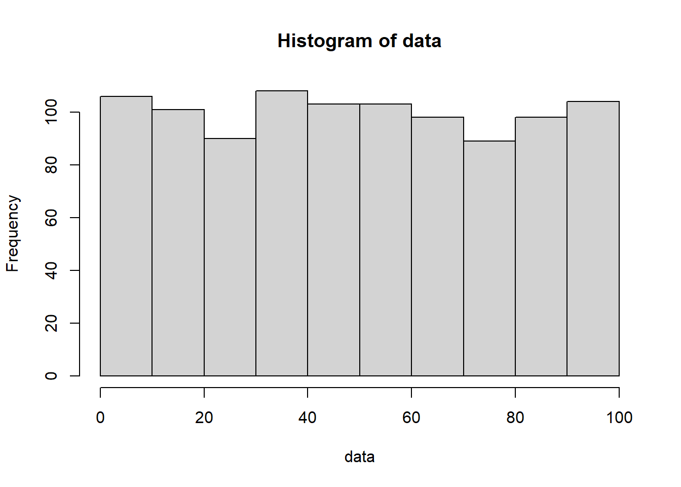
When I claim that “there is randomness in your data”, what does that mean? For some people, the term “randomness” implies complete unpredictability. Such people would interpret my claim to mean that every time you collect a new replicate, any value for the thing you are measuring is fair game and equally likely. “You got 100 reads from the MYC gene in your last RNA-seq dataset? Well don’t be surprised if you get 1000, or 10000, or 0 reads next time!” You may call this uniform randomness. You can generate such data right here in R, using the runif() function:
runif() has three parameters: 1) n specifies the number of numbers to generate, 2) min specifies the minimum number it could possibly generate, and 3) max specifies the maximum number it could possibly generate. In the above example, I am thus creating 10 numbers between 0 and 100, with every number in between being equally likely to pop out. Generate a lot more numbers and this uniform pattern of appearance becomes much more clear:
data <-runif(n =1000, min =0, max =100)hist(data)
While this definition of randomness is intuitive, it can’t be the only type of randomness. If RNA-seq data were this random, it would be useless! There is nothing to learn from measurements that can take on any value with equal probability.
Thus, to describe all of the kinds of randomness we see in the real world, it is important to expand our definition beyond uniform randomness. Enter the probability distribution. A probability distribution is like a function in R. It takes as input a number (or maybe a set of numbers), and provides as output, the probability of seeing that number. For uniformly random data this might look something like:
uniform_distribution <-function(data, min =0, max =100){if(data >= min & data <= max){ output <-1 }else{ output <-0 }return(output)}
That is to say, as long as the data is within the bounds of what is possible, it has the same probability of occurring; you get the same number out from this function. This function would make mathematicians